Enrich your design: leaflet printing from Solopress

30 November 2012

Proper BBQ by Tom Hayes

Crawling through Behance I decided to choose my new favourite London-based graphic designer for the first of a regular Friday feature I’m officially branding VisArt Friday where we will choose a favourite UK-based visual artist every week to share their work and why we like them. To kick off the first article in this brand new series we love the look of graphic designer Tom Hayes’ Proper BBQ branding.


There are several reasons as to why Proper BBQ has made its way into today’s VisArt Friday, one of which being the nostalgia you get, reminiscent of the stereotypical Old West, when looking at the font design and variety of textures it has been printed on.

Hayes has specifically targeted what he defined as “gentlemen” in his creative work and it has successfully captivated the men behind Inspiring Print. Perhaps it’s the masculinity associated with BBQs that has contributed to our undivided attention or maybe it’s the brilliant and simple design that we desire.


The mixture of metal, glass, twine and Hessian look and feel like very raw materials, which have been allowed to speak for themselves because of the very simplistic design approach utilising typography and border styles similar to the era they represent.


It is unclear whether or not these products are available to buy, as our online searches have been unsuccessful so far. One thing we’re certain of though is that these would be great sellers to BBQ blokes across the UK. It was only yesterday that BBC Radio 4 were discussing the stereotypes of men in the kitchen and that we’re more likely to buy ALL the gear involved with a cooking project because of our perfectionist nature compare to women who supposedly improvise.

Summary

Overall we massively enjoy the visual delights of Tom Hayes’ work here. The composition of the materials work nicely together with the simplistic design approach to create something that 21st Century cowboys of the barbeque world would be delighted to lasso off the shelf and into their kitchen cupboards.
To view Hayes’ Proper BBQ on Behance visit: http://www.behance.net/gallery/Proper-BBQ/3662161.

28 November 2012

The History of Printing Techniques in Video

Print is an amazing thing that has evolved over centuries from its first recorded evidence at around 3500BC when engraved cylinders were used to make impressions onto clay through to our modern day digital printing techniques, which involve no manual labour whatsoever.

Seeing as print has such a long history and takes a massive amount of time to explain how each of the processes works, we’ve decided to create a collection of the best videos we could find that explain each of the printing processes in the simplest ways possible. We’ve also presented them in chronological order with the dates of when the techniques were first conceived so that you can visualise the evolution of printing from its humble beginnings to now.

Let us know what your favourite printing technique is in the comments section at the bottom of this article.

Woodblock Printing - Year: 200

Bookkake Woodblock Printing from stml on Vimeo.

Movable Type - Year: 1040

Upside Down, Left To Right: A Letterpress Film from Danny Cooke on Vimeo.

Printing Press - Year: 1454

Letterpress from Naomie Ross on Vimeo.

Etching - Year: 1500

Mezzotint - Year: 1642

Making the plates:

Printing:

Aquatint - Year: 1768

Lithography - Year: 1796

Die Kunst der Lithographie from Max Negrelli on Vimeo.

Rotary Printing - Year: 1843

Offset Printing - Year: 1875

Lithography from Richard Masland on Vimeo.

Checkout Solopress for luxury business cards with free, next day delivery in the UK.

Hectographic Printing - Year: 19th Century

Hot Metal Typesetting (Linotype) - Year: 1886

"Linotype: The Film" Official Trailer from Linotype: The Film on Vimeo.

Screen Printing - Year: 1907

Moleskine Silk Screen Printing from Moleskine ® on Vimeo.

Spirit Duplicator - Year: 1923

Dye Sublimination - Year: 1957

Laser Printing - Year: 1969

Thermal Printing - Year: 1972

Inkjet Printing - Year: 1976

3D Printing - Year: 1986

3D Printing: A Time-Lapse from Liz on Vimeo.

Digital Printing Press - Year: 1993

The dates of these different printing techniques have been sourced from Wikipedia’s article on The History of Printing which can be found here: http://en.wikipedia.org/wiki/History_of_printing.

23 November 2012

This Year’s Christmas Wish List

This week the family have been asking the question that comes around once a year and that is “what would you like for Christmas?” As an amateur visual artist I can say that most of what I’ve been looking at has either been design or photography related so I’m going to share the three items I want the most this year.

Sorry to any young eyes reading this blog who believe that Santa will be bringing them their gifts this year. He doesn’t visit my house sadly so our parents get us presents instead :{P
 

Anywho here’s my three wants for the year, any of which I’d be ecstatic to receive:

Peleng 8mm Fisheye Lens


I’m a big fan of my Canon 1000D and have enjoyed taking photos with it for the past three years but I’ve recently wanted to do some cool wide angle shots at our local skate park. To get that cool effect that they show on the Extreme Sports channel I’ll need an extra wide lens like the Peleng Canon fit 8mm fisheye lens.


If I later decide to upgrade the camera to something more impressive like the 5D I’ll be able to film cool skate clips using this lens which will be great.

Current Price on Amazon: £198.00.

Wacom Bamboo Pen and Touch Graphics Tablet

For some time I’ve been drawing freehand with a good old fashion pen and paper and recently I’ve used a flatbed scanner to digitise my work just for personal enjoyment. I’ve now decided that for Christmas I’d like to receive a graphics tablet made by Wacom so that I can draw straight to PC.


I know many readers will be thinking why didn’t I choose the ones that are similar to an iPad yada yada. Reason 1 being they cost a lot more and reason 2 being I’d like to learn this way first as many professional digital artists have done this for years. After all I have a monitor in front of me to see what I am drawing.

Current Price on Amazon: £69.99.

Gig Posters Book


Last but not least is a book I’d love to get my grubby mitts on that will provide me with some inspiration for my own gig poster projects. The name of the book is Gig Posters: Rock Show Art of the 21st Century v.1.


I love the originality of the American gig posters and how they always seem far more impressive than the boring formulaic ones used for nightclub venues. I love it when a poster can make someone stop in their tracks and read on in awe. That’s what a poster should do!

Current Price on Amazon: £16.19.

I guess its fair to say that I don’t ask for a lot. For my last birthday I was asked what I wanted and I simply asked for the Jungle Book on DVD. Random I know! This may not be the expert graphic designer’s wish list of 2012, however, it is definitely similar to one of an amateur looking to learn.

22 November 2012

Anaglyph 3D Photography and Film

It’s been a while since we’ve posted something on Inspiring Print so I thought I’d share a recent purchase of mine with you that brings an old form of visual entertainment into the current day.

Last week I was having a browse through Flickr to learn from other peoples’ impressive photos by studying the EXIF data of those that had it available. I learn to shoot a lot of different styles with my DSLR by studying photos and how they were put together before playing with the settings and adding my own twist.

As I was searching I came across several 3D images that needed a pair of glasses with a red lens and a cyan lens, otherwise known as anaglyph 3D glasses, in order to appreciate the 3D effect. In true spontaneous style I jumped onto eBay and ordered myself a pair of them – 2 pairs for £2.


Since they arrived today I have spent a good portion of the morning looking at the different types of 3D images that are on Flickr and videos that have been uploaded to YouTube and Vimeo using this anaglyph style of 3D image recording.

Overall I am impressed at the wealth of material available to admire online, considering that 3D viewing of this kind went out of fashion for a while until Real D came into cinemas with their polarization systems, which you’ve undoubtedly used within the past 5 years if you have watched a 3D film in the cinema wearing passive glasses.


There is one major problem with the anaglyph glasses though and that is that the colouration of your picture isn’t as true as it would be using a pair of Real D’s polarised glasses because of the different coloured lenses. On the other hand, you do need a 3D source such as a 3D monitor or cinema screen in order to benefit from using the passive polarised lenses, therefore, if you’d like to create a 3D video that is viewable through all devices then anaglyph is the only way to go for now.


5 Cool 3D Photos

If you’re fortunate enough to have a pair of your own anaglyph glasses then have them at the ready as I show you five of the most impressive 3D photos I’ve come across today on Flickr.

1. A telegraph pole that looks real enough you could climb it:
http://www.flickr.com/photos/parallel_yoshing/4435473954/sizes/z/in/photostream/

2. All aboard the HMS Victory, you can almost smell the sea air:
http://www.flickr.com/photos/stereoviews/4671782299/sizes/z/in/photostream/

3. Take a trip to the Thames and see the London Eye from the comfort of your armchair:
http://www.flickr.com/photos/stereoviews/4468225752/sizes/z/in/photostream/

4. Feel the warmth of a big bonfire through your red and blue glasses:
http://www.flickr.com/photos/stereoviews/4429479321/sizes/z/in/photostream/

5. Be careful not to roll down this wicked spiral staircase as you peer into the concrete tornado:
http://www.flickr.com/photos/stereoviews/5050067331/sizes/z/in/photostream/

Anaglyph 3D Videos

After looking at 3D photos I decided to spend a little time on Vimeo to find an impressive 3D video that I could share with you. This one of some robots playing football was the best one I came across:


There are plenty of others to watch, however, you will notice if you browse for yourself with a pair of these glasses that video quality is an important factor in the success of the 3D effect – the sharper the better. Pixelated videos just look like a mess, twice!


DIY 3D Anaglyph Images/ Video

There are a bunch of lenses and cameras on the market that you can buy to achieve this type of 3D image or video (Amazon: http://amzn.to/UUvH8d), however, there are tutorials available to teach you how to make your own 3D anaglyph images using one camera.


http://www.flickr.com/photos/sklathill/450378602/sizes/z/in/photostream/

It is preferred that the subject you are taking a photo of is stationary to make the 3D effect work. The process involves taking two photos (one from a left eye perspective, the other from a right eye), which can be offset from one another using a software package like Photoshop and involves further editing. You will of course need to be wearing your red and blue glasses whilst constructing it.

A handy tutorial to learn this from can be found here: http://www.diyphotography.net/create-3d-anaglyph-images. Judging by the author’s 3D image portfolio, this tutorial should be a simple method that provides you with tight and impressive 3D results.

All in all I’ve enjoyed my little trip down memory lane to when I remember being a young one and using the paper version of these glasses at my local cinema. I am pleased that this has improved with the help of Real D though because of the colouration issue.

I will be trying the DIY tutorial in an attempt to create my own 3D photo, which I will post on here if successful. Tweet us your own attempts if you decide to at @inspiringprint.

26 October 2012

The Evernote Smart Notebook by Moleskine: An Honest Overview

I recently witnessed a graphic designer friend of mine purchasing what I personally deemed to be one of the most ridiculously overpriced ways of digitising paper format information. Introducing the Evernote Smart Notebook, created in collaboration between Evernote and Moleskine.


Don’t get me wrong, Evernote is a brilliant note taking platform. I use it on a daily basis to sync notes via the cloud to all of my devices which saves emailing individual pictures and corresponding notes using separate programmes. But as you’ll notice from my tone, I’m not a great believer in the benefits that Moleskine’s Smart Notebook provide.

This new “innovative” notebook is available to buy in both small (A6-A7 size) and medium (A5-A6 size) from $24.95 on Moleskine’s website - the innovation being that you can use a smartphone loaded with Evernote’s application to take a photo of your handwritten notes and illustrations. Sounds like something I was doing 5 years back with my Nokia N95 and a £1 notepad from my local high street. But wait! There’s more.

The pages within the book aren’t your regular ruled lines. They are dotted ruled lines, which according to Evernote accurately skews your work once the app has read the dot pattern so that you eliminate the problematic slanted shot of a page. The other version of the notebook also contains pages with dotted lines but as a grid pattern - more suitable for graphic designers.


Another supposed benefit of this book & app combo is the removal of shadows from the photos you take of the notebook, however, as a photographer myself I’m not convinced by this. First of all Evernote advises that “using your flash ensures that you’ll get the highest quality image” (http://blog.evernote.com/2012/08/24/the-new-evernote-smart-notebook-by-moleskine/) in which case you won’t get a shadow - you can even try this now by taking a snap of a word on a piece of paper with your smartphone. Secondly, the automatic removal of shadow, if true, is an amazing innovation as in my experience this is quite a lengthy Photoshop process, which has lead to me just re-taking photos. Hmm?

Last but not least is my favourite selling point: stickers! Yes that’s right you get stickers which allow quick tagging of your pages. All you have to do is stick one on the appropriate pages and your notes are categorised into the corresponding notebooks that you’ve registered each of the stickers to. But what do you do when your stickers run out is my question? Costly methinks when you could do this manually via the app.

So what are my final thoughts on the Evernote Smart Notebook? Well the upside is that you get 3 months of Evernote’s premium service which gives you a whopping 1GB upload allowance per month as well as a few other service related features. The downside is I don’t understand who this notebook is targeted at. Serious graphic designers and illustrators will have their methods of digitising their creative work using tablets, scanners, and a range of software suites. So who?

Give us your thoughts on Evernote’s Smart Notebook. A new age designer’s essential or a flash in the pan waste of money?

23 October 2012

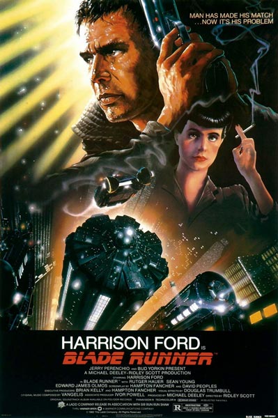
Blade Runner Poster Review (TuVie Day)

Directed by the brilliant Ridley Scott, Blade Runner is a fascinating film that was way ahead of its time and a good portrayal of the future city scenery that would be adopted by sci-fi films to follow in later years such as The Fifth Element and plenty of others.

The story follows the life of a Blade Runner named Deckard (Harrison Ford) – an agent that tracks down engineered humans, known as replicants in the movie, and terminates them in the year 2019. It’s a fairly standard cop hunts villains type of movie, however, they are also hunting for him, which adds another element of excitement to the plot.

Movie Poster Analysis

John Alvin, who also created the Gremlins and Star Wars Anniversary movie posters, created the movie poster for Blade Runner. The poster is an impressive piece of artwork, which identifies the replicants and the humans clearly and separately by adding sharper detail to the illustration of Deckard’s face in comparison to Rachael (the female character on the right) who is illustrated as a replicant through less sharpness and slightly thicker watercolours. She also looks similar to the Anime illustrations like Astro Boy.

The awesome scenery of the city tops is illustrated well to provide the reader with the futuristic element of the film and the punchy one liner “Man Has Made His Match…Now It’s His Problem” subtly opens you up to the theme of androids effectively.

Overall, the movie is perfectly illustrated in this poster and doesn’t leave too much to the imagination so as a first time viewer of it you’d get the gist of what it is all about.

22 October 2012

Moving Away From Apple Products A Little Bit


Apple is clearly one of the most popular brands for portable devices from tablets to smartphones in the UK. I'm not trying to spark a debate between Macs and Androids but it’s an observational analysis that most people have at least an iPhone or iPad on the London tubes.

After already owning an iPhone 4, I thought about getting the 5 but decided against it as my phone is still in great condition and I wouldn't be getting much more out of the new iPhone that I don't already get from my current model. This was the first instance where I've not followed the trend, as great looking as the iPhone 5 is.

Following this I decided I'd like to get a tablet because starting up the PC or Laptop at home is taking forever before I can quickly browse for something on the internet, and the tiny screen on my iPhone can be irritating unless if I'm out and on the go. The iPad was of course the first product I looked at because of the experience I've had with my iPhone.

I'm not sure why, maybe its the fact that I'm becoming wiser of the true value of things with age, but I couldn't justify parting with £330 of hard earned cash for the convenience I was after and the new iPad mini is rumoured to retail at around £300 - still far too much for my liking. So I decided to turn to the android side of life.

After looking at all the different tablets on the market I'd assessed that the Nexus 7 was the next best thing. The screen size is perfect - not too big and not too small. Also, I know that HTML5 etc are supposed to be making flash somewhat obsolete but I was relieved that I wouldn't get caught up as a casualty in one of Apple's corporate wars.

It has made me think though am I moving away from the Apple trend because I've always been a fan of their products since the launch of the iPod like many others who were attracted and bound by this innovation? As competitors begin to open up the mobile market for alternatives will I be brand hopping? I'm not sure.

On an Apple plus note, I'll be looking for a laptop later this year and I can definitely say that I can find no competitor for the MacBook pro yet. As an amateur designer, my experience with laptops and PCs so far using Adobe software hasn't been as smooth as I'd like. We'll see what they come up with in the following months but so far it looks like I'll be heading back into Apple's arms by the end of the year.

18 October 2012

Brilliant Ideas for Great Flyer Design

Flyers are a brilliant traditional print medium that has multiple uses, from wedding invitations to advertising. They can be printed on a range of different stocks to impress those receiving them including gloss, silk, and a variety of others, giving an attractive 2D design further depth.

There are some basic “rules” that should be learned before diving straight in and creating a flyer which are outlined in this article: “How to Design a Successful Promotional Flyer”. Once you’ve read that you can start getting creative and creating something completely original to suit the purpose of your flyer, be it for personal or business use.

In an attempt to inspire you before you begin putting pen to paper, we’ve sourced some really attractive and captivating flyer designs that you’re going to love. Read on and let us know what your favourites are.
Image Credit

Image Credit

Image Credit

Image Credit

Image Credit

Image Credit

Image Credit

Image Credit

Image Credit

Image Credit

16 October 2012

The Fall Movie Poster (TuVie Day)

Last weekend I stumbled across this movie, as my folks were half hour into it when I walked through the front door and sank into the couch ready to be captivated. To be honest it’s less about the poster this week than it is about the beauty of this great film that in its own right is a fantastic piece of visual art.

The locations and scenes within the movie are wonderfully directed, transporting you from a 1920s infirmary to a fantasy world and back through the stories of a stunt man to a little girl who has also been admitted for a broken arm.

I don’t want to give a great deal of the plot away other than that but if you watch the trailer you’ll get a great idea of what the film is about and witness a handful of the incredible scenes that combine to form this awesome movie.


The poster for The Fall is actually very reflective of the themes and scenes within the movie from the Taj Mahal outline to the butterfly nose. The main character in the fantasy story, “The Masked Bandit”, is displayed to the left with the little girl from the film’s eyes in the centre of the poster, making this design one that gives you everything from the film but no clear idea of the relevance they have. This is definitely one you will have to watch to find out more.

Check out the trailer for The Fall below:

9 October 2012

TueVie Day - 500 Days of Summer

If you've been following my blog series you'll have noticed that every Tuesday is Movie Day, which is why I've decided to re-brand as TueVie Day! Appropriate right?

So, this week we’re going to look at a great film poster for a movie that is ideal for couples or if you’re in a feel good-ish mood you could watch this on your own too: 500 Days of Summer. The storyline is fairly good and entangles a love scenario with a pursuit of happiness story, starring the beautiful Zooey Deschanel and the very cool Joseph Gordon-Levitt.

Looking at the film poster, its design is simple with Joseph Gordon-Levitt wearing a plain white T-shirt that has the title of the film and scenes of the movie placed on it. Features of the T-shirt have been maintained through the design, i.e. a crease is visible through the movie scenes to make it look like it was actually a printed design.
Although the design gives away the fact that it is a romantic movie, there is not much giveaway of the actual storyline, however, the scenes provided are typical of films of this nature, which have proven to sell seats in the past. What is unique is the choice of light blue and white with a grainy gauze over the design, giving it a vintage indie-style appearance (appropriate for the film style itself).

Overall, I enjoyed the film and suggest you take a look at the trailer below to get an idea of how fun the film is.
 

8 October 2012

Getting to Grips With Adobe Illustrator

This week I began playing with AI to transfer my paper illustrations to PC - yes PC not Mac (maybe a Mac one day when I have the dough). I've been getting my head around the various tools it has to give my work justice, which has meant reading plenty of tutorials online and following them to see how each of the different functions works. It's been fun to say the least but it takes some patience and getting used to.

To share some of the resources I've been using, as a total beginner on AI, I have selected my five favourite tutorials from last week which you can learn from if you are also a Noob or maybe refresh yourself if you've not used a range of tools it has for a while.

5 Adobe Illustrator Tutorials for Beginners

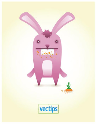
How to Create a Cute Bunny Vector Character


This tutorial shows you how you can take some really basic shapes and transform them into a cute little bunny. This lesson can provide you with a first step towards creating some original and unique characters of your own. To begin this tutorial visit: http://vector.tutsplus.com/tutorials/illustration/how-to-create-a-cute-bunny-vector-character/.

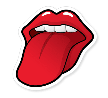
Create a Rolling Stones Style Mouth n Tongue

This tutorial takes hand drawings into account, as your first step is to scan in your drawing from paper to digitise it. This is exactly the kind of stuff I'm looking to do so open your eyes to this one and learn how to make your own cool Rolling Stones style graphic. Have a read of this tutorial at: http://blog.spoongraphics.co.uk/tutorials/create-a-rolling-stones-inspired-tongue-illustration.

Thug Bunny Symetry Tutorial

Learn how to create illustrations with symmetry in the simplest way possible in this tutorial. The bunny looks pretty awesome. I promise this addition is not just because I like bunnies as I noticed the first tutorial is of a bunny. This one is more about learning how to make your design more symmetrical. Read how to do it at: http://illustrationclass.com/2008/07/07/thug-bunny/.

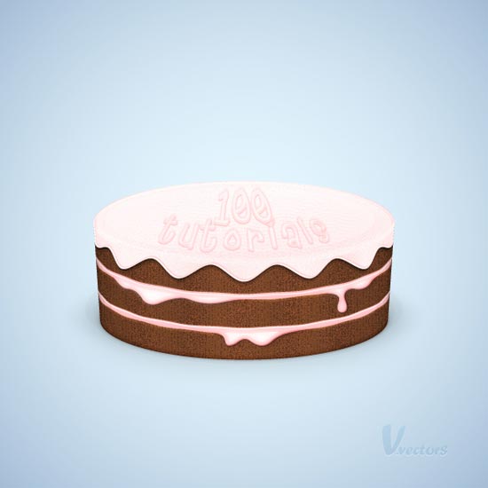
Making a Cake Illustration


Nearly as good looking as the real thing, this tutorial teaches you how to make a tasty looking treat. Moving through a range of different tools this one takes you into a 3D element of illustration. Try this tutorial at: http://vector.tutsplus.com/tutorials/illustration/how-to-create-a-detailed-cake-illustration/.

Create a Vintage Badge

I turned to this tutorial because I'm going to look for an interesting way to brand my work with a logo or stamp of some kind. This vintage style appealed to me the most which could also be of interest to you if you're looking to sign off your work somehow. Find out how to make this vintage badge at: http://abduzeedo.com/vintage-badge-illustrator-and-photoshop.

That's all for now. I hope you find some inspiration in these tutorials as well as learn how to transfer your paper makings into graphic designs. Good luck and have fun the same way I have. Just be patient.

5 October 2012

Autumn's Natural Beauty

I love this time of year, mainly because I know that Christmas is around the corner, which means I get to spend some quality time with my family. The other reason is because of the transformation in colour that happens to our natural environment.

What was once green is now becoming a mixture of reds, browns, yellows, and oranges. The streets begin to look as though they are on fire with the litter of leaves whirling around in the brisk air, almost like a delicate ballet of colour.

The change from summer to autumn is perfectly captured in this photograph which is today's IP favourite from Deviant Art user Kariliimatainen. Admire its beauty and get ready for the chill.


25 September 2012

Movie Day - Warrior

Last weekend my brother introduced me to this film on Netflix. It had good reviews and was about MMA so instantly I was hooked. I was cautious about this one though after being bitterly disappointed with Channing Tatum's efforts at MMA in Fighting.

Starring Joel Edgerton as the man fighting to keep his family's roof over their heads and Tom Hardy as an absolute animal (pre-Bane) who is fighting to support his departed military comrade's family, whilst rivalling his brother over dark family history, this film is inspirational to those who train for any contact sports from the training through to the fights themselves.


The movie poster for Warrior is similar to the promotional boxing posters advertising big upcoming fights. This is achieved using a blacked out environment with a small light source on one side of the actors. Each image is of course shot separately and then stitched together with black space in between them for the text to impact in the way that it does.

The black and white theme is very strong and gives you a sense of the drama involved with the storyline. Somehow there is mild warmth provided with the orange/ gold "FIGHT FOR FAMILY" line, which is appropriately placed in relation to the character. Perhaps an effect that colour has on our beings at a subconscious level.

As a comparison, here's the Tyson vs Holyfield fight poster, which is a similar fight promotion poster that the Warrior's film poster is based on.


24 September 2012

Crayola Makes a Comeback by Melting


How well do you remember the art lessons you were taught in primary school? My fondest memories included the use of Crayola crayons to colour in our pencil drawings. There was always something fascinating about the shiny silver and gold colours, which usually lead to petty classroom fights over who got to use them next.

The majority of our “art” back then could be broadly described as inventive scribbles now. You never quite master how to get that stick of wax to stay within the lines until you’re an older age. I guess it depends on your interpretation of what art is at the end of the day.

The new popular art form using crayons no longer includes drawing the way we did when we were young. Instead people have been using a combination of canvas, sticky tape and a hairdryer to make something pretty with ease.

Image courtesy of amslerPIX
It’s fairly simple to make. All you have to do is fix a number of crayons to the top of a blank canvas using double sided tape or possibly PVA glue and make sure the tops of them are pointing towards the bottom of the canvas. The next step is to plug in your hairdryer and melt them to a point where you can start blowing the colours into one another. Finally you leave it to set. Simple!

There have been adaptations of this cool medium, which integrate other art forms alongside this simple technique. The example below is taken from http://www.etsy.com/listing/87669543/custom-melted-crayon-art-with-your.

To find out more about how you can make your very own piece of melted crayon art click here.

21 September 2012

Impressive, Super-Dooper, Jaw Dropping Illustrations

Everyone loves an image that can make their jaw hit the floor in amazement and preferably in admiration not disgust. If its that good, some of us will go as far as making these impressive illustrations a part of our lives through posters, wallpapers, sharing them on our social walls, and posting them as our avatars.

Seeing as its Friday we'll take it easy on the cognitive side of things and try to impress you with some great images we like from the web. Without further ado, here's the Inspiring Print collection of impressive, super-dooper, jaw-dropping illustrations.

Image Source

Image Source

Image Source

Image Source

Image Source

Image Source


Image Source

Image Source

Share This Page