Enrich your design: leaflet printing from Solopress

Showing posts with label TueVie Day. Show all posts

5 March 2013

Avengers Assemble - TueVie Day

The Avengers movie poster successfully advertised one of the biggest blockbusters of 2012 with the help of previous Marvel franchise movies that had short teaser clips after their credits - all of which were leading to Avengers Assemble.

Today we're going to analyse some of the design choices made within this movie poster to better understand the relevance of it to the movie content.

Critique

Character Fame

Each superhero in this poster had feature movies created for their character's storyline, except Hawkeye (Jeremy Renner), and all of the original cast from these previous films were kept with the exception of The Hulk who was played by Mark Ruffalo (played in two previous Hulk movies by Eric Bana and Edward Norton).

The popularity of each feature movie character most-likely lead to their apparent visual rank in the poster: Iron Man stealing the most focus (as the most famous character in the franchise) leading all the way back to a more discreet Nick Fury (Samuel L. Jackson) who has been cleverly positioned in the centre of the poster - this is an illustrative representation of his relevance to the other characters as the one that brings the superheroes together.

The Scene

The scene presented is almost lifted straight out of the movie content, featuring a beam of light above Stark towers (a focal point in the plot) and the destruction of a city - an expected setting for almost all Marvel movies.

Interestingly the good guys are all featured within this illustration but the enemy is not - a deliberate choice to add mystery to the enemy’s identity or to avoid confusion the potential confusion that the enemy is a part of The Avengers?

Appearance

The poster does look a bit unimaginative by just placing all of the superheroes standing together, almost as if they were photoshopped straight out their feature movie scenes and placed together. 

On the other hand, what the poster lacks in imagination it makes up for in quality of appearance as the filters applied give it a hand-painted look - a homage to the paper format this story originally came from?

In all honesty you wouldn't expect as good of a poster as this is to have been produced for such a big name franchise anyway as you'd presume that the Marvel company would've generated enough hype through trailers, entertainment media, and their fan base that a poster wouldn't have provided anything more other than a pin up for die hard Avengers fans.

Summary

If you have seen the Avengers then you will agree that the poster gives good insight into the storyline minus an appearance of the archenemy, which adds mystery as to who it is unless you follow the films and their end of trailer clips.

Overall I admire the artist's attempt at re-creating the hand-painted medium that historic poster artists previously used but in a digital format, giving the poster more association with the illustrated comic books.

The film itself is very entertaining and worth watching if you are a fan of big action scenes and previous Marvel movies. Just for your entertainment, here's the official Avengers trailer:

19 February 2013

The Matrix Movie Poster - TuVie Day

Today we’re taking a look at the promotional poster for a movie that transformed many people’s perceptions of reality and left many questioning the validity of our existence. Starring Keanu Reeves & Laurence Fishburne, The Matrix is going under the microscope in today’s TuVie Day!

The Matrix is one of the must see films that made an impact in the 90s when it was first released because of the way it took what you’d perceived as real life and made it appear like a piece of software in a complex computer program (The Matrix) - a virtual reality.


One of the reasons for The Matrix’s massive impact at this time was the boom of computer usage in households in addition to the fact that there had been no movie made like this before its birth. It was therefore inevitable that forum user handles began appearing over the internet as Morpheus, Neo and Trinity - the lead characters from the film, after its launch.


The Storyline

Without giving too much away, the basic storyline involves a hacker named Thomas A. Anderson (Reeves) who moonlights as a hacker whose alias is displayed as Neo. His online quest for “The Matrix” leads him to connect with Morpheus (Fishburne) who is initially described as a terrorist in the virtual reality, however, he is later discovered as the leader of a mercenary group who have been searching for Neo outside of this virtual reality.

To explain The Matrix Morpheus compares it to Alice In Wonderland and gives Neo the choice to remain in this virtual reality by taking a blue pill or find out what The Matrix is by taking a red one (chasing the rabbit down the hole to Wonderland).

Actual reality is a much poorer world in appearance where hard graft is needed to survive against technology that the humans had initially created. In this world where technology is self-maintaining it still needs human life as a source of power, which leads to humans being manufactured by the machines - a complete reverse to our current situation where we manufacture machines for use.

As I said I don’t want to give away too much about this film and its a hard one to explain, however, all I will say is that the story continues to show Neo as “the chosen one” who has been woken from the virtual reality in order to help save the human race from the machines that rule that world.


The Matrix Movie Poster Critique

The Matrix movie poster designed by Concept Arts


In overall appearance The Matrix movie poster is very striking with the lead character or Neo given primary focus alongside his leather wrapped colleagues. Almost none of the plot is given away in this poster, however, themes within the film are presented e.g. the falling lines or text that look similar to binary code are placed on the background to the characters. In the film we realise that this virtual reality is made from this code, therefore, the designer’s choice to place it on the walls (an element of this virtual world) is a subtle hint at what The Matrix is.

The fragmented logo of the movie has a similar appearance to an image that is loading on an old PC line by line but also looks like it is struggling, which subtly displays the technology theme. Additionally, the clear evidence of guns gives away the fact that this is an action movie, confirmed by the subtitle containing the word “fight”.

The photoshop cutouts of the characters is somewhat laughable when you consider the budget that would’ve been spent on the film’s content. You’d think that a slightly more exciting and imaginative representation of The Matrix could have been created rather than just having the characters standing around with guns, however, action film posters of the late 90s followed a very similar format so you can’t entirely knock it.


Summary

To summarise I’d have to say that not only is the movie well made but the poster is well structured for its time. I’d like to see a more imaginative representation of this poster created by an artistic fan as I feel with the current technology available to graphic designers there is something more impressive to be made that will give this film justice.

This week The Matrix gets an 8 out of 10, mainly because the poster’s design isn’t as imaginative as I feel it could be to present the great themes within the story.

If you haven’t seen The Matrix before, here’s the movie trailer for your enjoyment:


6 February 2013

Sexy Beast Movie Poster

As a fan of British gangster movies I got to see a great one created by the Film on 4 company, which was a perfect combination of edginess and comedy like the kind you’d find in Snatch. The movie I am referring to is Sexy Beast, which is brought to life with the terrific performances of Ray Winstone and Ben Kingsley (otherwise known for roles such as Ghandi and soon to be in Iron Man 3).

The Storyline

The storyline of this movie is a classic heist plot where Don Logan (Kingsley) is sent by the mob to convince an old-time gang member, Gal (Winstone), out of retirement for a job that he is reluctant to take part in. The comedy comes from various angles but none more memorable than Don’s methods of persuasion that only make you laugh but also strike moments of fear from his unpredictability.

Without giving too much of the story away I’d have to recommend this classic film to lovers of this genre but if you take great offence to the C word you might need to re-consider it – you have been warned.

Sexy Beast movie poster created by Empire Design

Movie Poster Critique

The movie poster for Sexy Beast is totally reflective of the opening scene where Gal is living the high life. The image of Winstone lounging back on a floating armchair inside of a cocktail glass is one that contradicts the film title itself and additionally after watching the film I’ve noticed the subtle connection of the red fluid at the bottom of the cocktail glass and the by-line “it’s hard to say no”. Its down to you to watch it to notice the giveaways in the poster too.

I’m torn between deciding whether or not the cocktail glass image is artist’s representation of the film or pieced together from images in Photoshop. Whichever it is, I’m drawn to the smooth appearance of the whole image like film posters from the 80s.

Summary

Overall the poster for Sexy Beast is a great piece of work that perfectly reflects the themes inside of the film without giving too much of the storyline away. I wish more movie posters were this clever these days rather than just taking a scene from the film with no subtleties like those I’ve explained. I know it goes against my stance on posters that don’t give away the film clearly enough but this one is composed with such finesse that I would have to admit more like this could sway my overarching opinion on the matter.

The movie gets a 10/10 from me. It ticked all the right boxes that a British gangster film should and the poster is impressive in its portrayal of the film. If you haven’t seen Sexy Beast before, here’s a trailer:

29 January 2013

The Boxer Movie Poster

It’s been while since we’ve had a Tuesday movie poster review (TuVie Day) so let’s kickstart the habit with a film I recently caught on Sky Movies called The Fighter. Staring Mark Wahlberg (famously known for performances in flicks such as Ted), Amy Adams, and the best Batman in history Christian Bale; this film is one for you aspiring boxers out there who love to see inspiring true life stories reach the big lights of Hollywood.

Image courtesy of BLT Communications, LLC

The Storyline

The film follows the story of Micky Ward – a junior welterweight professional boxer, and the journey that lead to his professional career as a boxing superstar. What captured my attention most was the relationship between Micky and his brother Dicky, who was said to have trained Micky all the way through to his professional status. With family problems being a persistent theme throughout the movie, the reality of the story and performance of the actors makes you feel closer to the characters rather than the rose-tinted nostalgia of the Rocky series, which fails to captivate you on the same emotional level but is set around the same time period.

Movie Poster Critique

The Boxer’s poster is a personal favourite due to the fact that I am a gigantic photography geek and a fan of monochrome imagery. The artist’s choice of presenting the lead character in the boxing ring at the moment he has been awarded the win from a bought with one of his challengers gives a simple, clear pre-cursor of what to expect from this movie – as you can tell from previous articles I’m not a huge fan of mystery. The typical display of main characters by using angled headshots is nothing new at the head of the poster, although the contrast between the clear typography and the grainy effects of noise added to the images creates an old vintage feel mixed with modern day style – an excellent way to show that the storyline is of historical content.

Summary

Overall I’d give the film a 4 out of 5 as the quality of the actual boxing scenes disappointed me. It’s possibly because I am used to the edginess of fighting scenes such as those in Warrior and The Bourne series. Just in case you haven’t seen the film before here’s the trailer:

23 October 2012

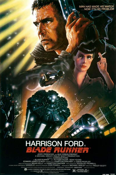
Blade Runner Poster Review (TuVie Day)

Directed by the brilliant Ridley Scott, Blade Runner is a fascinating film that was way ahead of its time and a good portrayal of the future city scenery that would be adopted by sci-fi films to follow in later years such as The Fifth Element and plenty of others.

The story follows the life of a Blade Runner named Deckard (Harrison Ford) – an agent that tracks down engineered humans, known as replicants in the movie, and terminates them in the year 2019. It’s a fairly standard cop hunts villains type of movie, however, they are also hunting for him, which adds another element of excitement to the plot.

Movie Poster Analysis

John Alvin, who also created the Gremlins and Star Wars Anniversary movie posters, created the movie poster for Blade Runner. The poster is an impressive piece of artwork, which identifies the replicants and the humans clearly and separately by adding sharper detail to the illustration of Deckard’s face in comparison to Rachael (the female character on the right) who is illustrated as a replicant through less sharpness and slightly thicker watercolours. She also looks similar to the Anime illustrations like Astro Boy.

The awesome scenery of the city tops is illustrated well to provide the reader with the futuristic element of the film and the punchy one liner “Man Has Made His Match…Now It’s His Problem” subtly opens you up to the theme of androids effectively.

Overall, the movie is perfectly illustrated in this poster and doesn’t leave too much to the imagination so as a first time viewer of it you’d get the gist of what it is all about.

16 October 2012

The Fall Movie Poster (TuVie Day)

Last weekend I stumbled across this movie, as my folks were half hour into it when I walked through the front door and sank into the couch ready to be captivated. To be honest it’s less about the poster this week than it is about the beauty of this great film that in its own right is a fantastic piece of visual art.

The locations and scenes within the movie are wonderfully directed, transporting you from a 1920s infirmary to a fantasy world and back through the stories of a stunt man to a little girl who has also been admitted for a broken arm.

I don’t want to give a great deal of the plot away other than that but if you watch the trailer you’ll get a great idea of what the film is about and witness a handful of the incredible scenes that combine to form this awesome movie.


The poster for The Fall is actually very reflective of the themes and scenes within the movie from the Taj Mahal outline to the butterfly nose. The main character in the fantasy story, “The Masked Bandit”, is displayed to the left with the little girl from the film’s eyes in the centre of the poster, making this design one that gives you everything from the film but no clear idea of the relevance they have. This is definitely one you will have to watch to find out more.

Check out the trailer for The Fall below:

9 October 2012

TueVie Day - 500 Days of Summer

If you've been following my blog series you'll have noticed that every Tuesday is Movie Day, which is why I've decided to re-brand as TueVie Day! Appropriate right?

So, this week we’re going to look at a great film poster for a movie that is ideal for couples or if you’re in a feel good-ish mood you could watch this on your own too: 500 Days of Summer. The storyline is fairly good and entangles a love scenario with a pursuit of happiness story, starring the beautiful Zooey Deschanel and the very cool Joseph Gordon-Levitt.

Looking at the film poster, its design is simple with Joseph Gordon-Levitt wearing a plain white T-shirt that has the title of the film and scenes of the movie placed on it. Features of the T-shirt have been maintained through the design, i.e. a crease is visible through the movie scenes to make it look like it was actually a printed design.
Although the design gives away the fact that it is a romantic movie, there is not much giveaway of the actual storyline, however, the scenes provided are typical of films of this nature, which have proven to sell seats in the past. What is unique is the choice of light blue and white with a grainy gauze over the design, giving it a vintage indie-style appearance (appropriate for the film style itself).

Overall, I enjoyed the film and suggest you take a look at the trailer below to get an idea of how fun the film is.
 

Share This Page