Enrich your design: leaflet printing from Solopress

25 September 2012

Movie Day - Warrior

Last weekend my brother introduced me to this film on Netflix. It had good reviews and was about MMA so instantly I was hooked. I was cautious about this one though after being bitterly disappointed with Channing Tatum's efforts at MMA in Fighting.

Starring Joel Edgerton as the man fighting to keep his family's roof over their heads and Tom Hardy as an absolute animal (pre-Bane) who is fighting to support his departed military comrade's family, whilst rivalling his brother over dark family history, this film is inspirational to those who train for any contact sports from the training through to the fights themselves.


The movie poster for Warrior is similar to the promotional boxing posters advertising big upcoming fights. This is achieved using a blacked out environment with a small light source on one side of the actors. Each image is of course shot separately and then stitched together with black space in between them for the text to impact in the way that it does.

The black and white theme is very strong and gives you a sense of the drama involved with the storyline. Somehow there is mild warmth provided with the orange/ gold "FIGHT FOR FAMILY" line, which is appropriately placed in relation to the character. Perhaps an effect that colour has on our beings at a subconscious level.

As a comparison, here's the Tyson vs Holyfield fight poster, which is a similar fight promotion poster that the Warrior's film poster is based on.


24 September 2012

Crayola Makes a Comeback by Melting


How well do you remember the art lessons you were taught in primary school? My fondest memories included the use of Crayola crayons to colour in our pencil drawings. There was always something fascinating about the shiny silver and gold colours, which usually lead to petty classroom fights over who got to use them next.

The majority of our “art” back then could be broadly described as inventive scribbles now. You never quite master how to get that stick of wax to stay within the lines until you’re an older age. I guess it depends on your interpretation of what art is at the end of the day.

The new popular art form using crayons no longer includes drawing the way we did when we were young. Instead people have been using a combination of canvas, sticky tape and a hairdryer to make something pretty with ease.

Image courtesy of amslerPIX
It’s fairly simple to make. All you have to do is fix a number of crayons to the top of a blank canvas using double sided tape or possibly PVA glue and make sure the tops of them are pointing towards the bottom of the canvas. The next step is to plug in your hairdryer and melt them to a point where you can start blowing the colours into one another. Finally you leave it to set. Simple!

There have been adaptations of this cool medium, which integrate other art forms alongside this simple technique. The example below is taken from http://www.etsy.com/listing/87669543/custom-melted-crayon-art-with-your.

To find out more about how you can make your very own piece of melted crayon art click here.

21 September 2012

Impressive, Super-Dooper, Jaw Dropping Illustrations

Everyone loves an image that can make their jaw hit the floor in amazement and preferably in admiration not disgust. If its that good, some of us will go as far as making these impressive illustrations a part of our lives through posters, wallpapers, sharing them on our social walls, and posting them as our avatars.

Seeing as its Friday we'll take it easy on the cognitive side of things and try to impress you with some great images we like from the web. Without further ado, here's the Inspiring Print collection of impressive, super-dooper, jaw-dropping illustrations.

Image Source

Image Source

Image Source

Image Source

Image Source

Image Source


Image Source

Image Source

17 September 2012

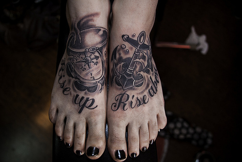
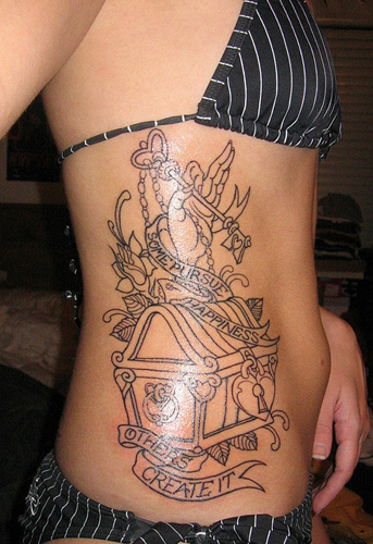
10 Inspirational Tattoo Ideas

About a year ago I had a tattoo designed and inked by my local tattoo parlour and I must admit I enjoyed it because I knew I was getting something that meant a great deal to me. Everyone focuses on the pain but its comparable to life in a way that you must endure pain at times to get what it is that you really want.

It is evident that plenty of people rush into getting them done as a spur of the moment thing, which is great in some respects e.g. if you're on a holiday and decide to do it because it'll be how you remember that particular holiday (if it has a reason to be so memorable). It is advised though that you really think long and hard about what it is that you want because it is a decision that will be with you all of your life. It took me three years to decide on mine.

Searching for ideas on what you could have done can be a long process which is why I've decided to get 10 of the most inspirational tattoos that I like. Hopefully they’ll help you decide on what you'd like to get done. Let me know what your favourites are in the comments below and leave me any suggestions of your own favourites to check out.


Hopefully you've found something you like in this little collection. Let me know what your favourites were in the comments section.

13 September 2012

How to Photograph People Jumping

Image Credit
Quite some while ago I had fun with some friends and my DSLR when we jumped into swimming pools, on a bouncy castle, and even off a tree in the park. The classic shot was "the superman" as the shots we were trying to get made us look like we were levitating with ease. It was fun but believe me, knowing that there was a soft landing below definitely helped get some confident shots.

This is just one of the fun ways you can enjoy the benefits of high speed photography and probably one of the most used, however, its been used mainly in sport to get that perfect action shot from football to horse eventing.

We're going to look at how you can use your DSLR to get a cool photo of your friends or family doing some kind of cool jump mid-air.

DSLR Camera

Incase you didn't know, DSLR stands for Digital Single Lens Reflex. It's basically what the 'professionals' use in the photography world and generally the higher the price the more you get. If you don't have a DSLR you might not gain the same results but some cameras have a sports mode or the option to increase the shutter speed. These might also be able to get these types of photos but might be slightly delayed on the trigger. Personally, we'd recommend getting your hands on a DSLR. The photo below is the one we use.

Image Credit

Camera Settings For Jump

To gain a pixel sharp image you'll find there will be a lot of trial and error involved, however, the main thing to remember is that you need a high shutter speed. The Canon 1000D goes up to 1/4000 which is pretty fast. The problem though is the higher you go the less light you allow the camera to capture and compose a nicely balanced image from. Therefore, you need to adjust the amount of aperture too allow more light through the lens whilst you're taking these high speed photos. The lowest allowed on our camera s F4.0 - the higher this number goes the less light you allow in through the lens.
Image Credit
If you find that you're still getting low light images then you'll want to bump up the ISO on your camera. Ours goes up to 1600. What this does is it allows you to increase the sensitivity of the camera's sensor to light. Be warned though. The higher you go, the more grain your image can get. If you shoot your photos in RAW though you can edit this out in Photoshop to some level.

Image Credit
Overall, it's all about balance as different lighting conditions will alter your ability to shoot at high speeds as well as the capabilities of your camera and even your lens. Some lenses allow more light to reach the sensor meaning a lower F-stop number and personally we'd recommend fixed lenses for really sharp images as there's no moving mechanism for the zoom function.

A good gauge to start from would be the following:
  • shutter speed 1/250
  • aperture F5.6
  • ISO 800
From here you can adjust accordingly to the images you're shooting.

We hope this has been a helpful cheat sheet to taking high speed photos of people jumping. If you feel like you have more to add to this please leave a comment. Otherwise, happy shooting!

For further help with photography tips, take a look at our previous article on photography tips which has our helpful guide to how shutter speeds, apertures, and ISOs work: http://www.inspiringprint.blogspot.co.uk/2012/08/newbie-photographer-resources-and-advice.html.

11 September 2012

A New Inspiring Print Header

I decided to share this with all of you because at the end of the day it's going to be a part of the new design for this blog. Check it out and wait for it to come ;)

Movie Day - Juno

There's an odd feel good factor behind watching films like Juno because of the real life theme of pregnancy and the trials and tribulations appended to it. It's okay it all works out in the end if you haven't seen it yet (apologies for the spoiler but really, how did you think a teen movie on pregnancy would end?).

The film has this overall "indie" appeal about it - that means it had a low budget quality about it, which is not uncommon considering its a Michael Cera and Ellen Page movie. This effect is clearly sought after as the choice of soundtrack, featuring the likes of Sonic Youth and The Moldy Peaches, combined with the 3D sketchbook font, similar to the 16 and Pregnant MTV series, gives a cool hipster-style feeling to it all. To top it off the choice of dry humour definitely worked with the characterisation of Juno and her relationship with her family.

Image Credit


From a design perspective, the Juno film poster was perfectly in line with the film's themes and 'artistry'. The title for one is the exact font used in the film, not unusual but still nice to look at and suggestive of the movie's indie effect. I'm not sure if its intentional but Nike's product placement is clear on this poster with Cera's trainers. Who knows? Maybe I pay attention to marketing messages too much.

The colour choice of the poster is orange on white, related to one comic theme within the movie of Tic Tacs, however, it is a colour tone I've seen used in film posters similar to this style of movie such as Adventureland and Little Miss Sunshine. It's probably a feel good colour that entices that type of audience to watch these types of film. After all orange spectrum colours are emotionally connected with happiness.

For those of you who have no idea what I'm talking about, here's the Juno trailer:

~

10 September 2012

Inspiring Print on Google Plus

So I've decided to show my face, some of it anyway, on Google+ as I understand that this is one of the biggest social networks for bloggers. Hmm. First thoughts: it is so much cleaner than Facebook with a hell of a lot more thought about design. I like the white space, almost Apple-esque with applications that animate as fluent as water.

It's a brilliant thing really where you can discuss on exact topics i.e. if I want to have a little chat about graphic design then I'd just search it in the bar at the top. Loads of results from other users come up in the stream and you can comment with them, add your own content to the discussion, and even start a video call on one of the topics with the author. How cool!

If you feel like you want to add me to your "circles" then feel free to do so. My profile can be found at: https://plus.google.com/u/0/105101232482044741860/posts.

The weather seems to have done a complete 360 today so hopefully I'll find some nice inspiration to keep you readers entertained later on when that Monday feeling really kicks in. P.S. if you have any stuff you'd like to share through my blog i.e. creations you've made, stuff you like the look of or even news from the globe just drop me a message through my Google+ account or even send me an email at inspiringprint{at}gmail.com.

6 September 2012

I'm Not Listening, Too Busy Doodling

I just got off the phone on a conversation that felt like it was dragging on and repeating the same messages over and over. After the second repitition I lost interest and my pen invetably met my notepad. I scribbled.

I continued to scribble until the ink started to form something visually appealing until the point where I had to engage in conversation again. This procrastination did get me thinking though. Why do we scribble and what does it mean? Is there design potential in all of us, as I'd believe it impossible to find a single person who hasn't ever doodled in a moment of boredom?

Following the conversation, I've decided to find and share some of the most ellaborate designs that could've potentially begun as a doodle of boredoom. Let me know if you like them and also if you think you've got something really creative you'd like to share on Inspiring Print then message me in the comments.


sinsofthedove

vmcamposjr

zarprey

I only know where a few of this awesome creations come from so if you created one of these let me know so I can give you a lil shout out!

Share This Page