Enrich your design: leaflet printing from Solopress

20 May 2013

Explosion Inspired Cupcake Logo from Acer

I remember watching an advert in recent months that featured Kiefer Sutherland, some explosives, and cupcakes. It sounds like a light moment in 24, however, it wasn’t. It was in fact a YouTube advert (commercial if you’re American) that showed off Sutherland’s comical macho baking style alongside an Acer laptop that I can’t actually remember the model of.

Why did I bring this up now? Well after reading a naff inspirational article explaining that business card ideas are everywhere I decided to find the most obscure inspiration I could find for a business logo - enter the most memorable part of this video.

Check out how Sutherland gets his logo inspiration when rebranding this nerdy kid’s cupcake business:


The explosion of a 4x4 is definitely one of the most random and arduous ways to get some inspiration for a logo that I’ve seen in my time, however, it just goes to show that design inspiration in general is everywhere.

Point made, that is all.

29 April 2013

The Mercedes Logo: A Simple Depiction of Dominance

The three pointed star has become a well-known symbol, a visual representation of the embodiment of class that all Mercedes vehicles ooze. But where did it come from?

The three points initially stood for the three methods of travel. That is land, sea and air. Upon the Daimler and Benz merger the three pointed star became encompassed in a circle, and the Mercedes-Benz logo as we know it today was born.


The colour silver also has a strong tie to the Mercedes brand. This dates back to 1934 in Nurburgring, when Mercedes entered their first grand prix. The vehicle was just a little over the weight limit so the Mercedes engineers spent the night sanding off the paint and stripping the car back to its original colour. This car went on to be better known as “The Silver Arrow”.

The beginnings of the Mercedes-Benz company was formed back in 1926, although the origins can be traced right back to 1886 and Karl Benz patent Motorwagen.

Gottlieb Daimler and Wilhelm Maybach formed the company after merging with Benz & Cie. The name Mercedes was chosen after one of Maybachs daughters.


Written by Hayley Reeve on behalf of Service 4 Service, offering approved Mercedes Service Southend, Essex.

23 April 2013

BMW Logo Origin Myth Debunked

When searching for the origins of BMW's logo you will no doubt come across the common myth that it was based on the propellers/ air screws of their aircraft (the white part of the logo) cutting through the sky (the blue part of the logo).

We say myth because since this presumption, which originated from a 1929 BMW aircraft magazine that illustrated two planes with the logo placed in the centre of their propellers, BMW recorded and published the following video to explain the actual origins of its logo:


So the first documented instance of the logo was actually in BMW's archives dated 1918 - way before the magazine was printed and was not based on propeller blades cutting through the sky.

Instead the BMW logo was actually based on the RAPP's original logo (the aircraft manufacturing company that eventually became BMW) alongside the national blue and white colours of Bavaria. When you see the two logos side by side you can identify the similarities in letter spacing and design.


Now if someone talks to you about the origins of BMW's logo and how it was based on the 1929 publication you can correct them. To add extra trivia you can also tell them it didn't first appear on a road vehicle until 1923 on BMW's R32.

Created by Service4Service, independent BMW specialists offering approved BMW service Derby in Derbyshire. With up to 60% off main dealer costs, every service includes free pick up, delivery, and car wash.

5 March 2013

Avengers Assemble - TueVie Day

The Avengers movie poster successfully advertised one of the biggest blockbusters of 2012 with the help of previous Marvel franchise movies that had short teaser clips after their credits - all of which were leading to Avengers Assemble.

Today we're going to analyse some of the design choices made within this movie poster to better understand the relevance of it to the movie content.

Critique

Character Fame

Each superhero in this poster had feature movies created for their character's storyline, except Hawkeye (Jeremy Renner), and all of the original cast from these previous films were kept with the exception of The Hulk who was played by Mark Ruffalo (played in two previous Hulk movies by Eric Bana and Edward Norton).

The popularity of each feature movie character most-likely lead to their apparent visual rank in the poster: Iron Man stealing the most focus (as the most famous character in the franchise) leading all the way back to a more discreet Nick Fury (Samuel L. Jackson) who has been cleverly positioned in the centre of the poster - this is an illustrative representation of his relevance to the other characters as the one that brings the superheroes together.

The Scene

The scene presented is almost lifted straight out of the movie content, featuring a beam of light above Stark towers (a focal point in the plot) and the destruction of a city - an expected setting for almost all Marvel movies.

Interestingly the good guys are all featured within this illustration but the enemy is not - a deliberate choice to add mystery to the enemy’s identity or to avoid confusion the potential confusion that the enemy is a part of The Avengers?

Appearance

The poster does look a bit unimaginative by just placing all of the superheroes standing together, almost as if they were photoshopped straight out their feature movie scenes and placed together. 

On the other hand, what the poster lacks in imagination it makes up for in quality of appearance as the filters applied give it a hand-painted look - a homage to the paper format this story originally came from?

In all honesty you wouldn't expect as good of a poster as this is to have been produced for such a big name franchise anyway as you'd presume that the Marvel company would've generated enough hype through trailers, entertainment media, and their fan base that a poster wouldn't have provided anything more other than a pin up for die hard Avengers fans.

Summary

If you have seen the Avengers then you will agree that the poster gives good insight into the storyline minus an appearance of the archenemy, which adds mystery as to who it is unless you follow the films and their end of trailer clips.

Overall I admire the artist's attempt at re-creating the hand-painted medium that historic poster artists previously used but in a digital format, giving the poster more association with the illustrated comic books.

The film itself is very entertaining and worth watching if you are a fan of big action scenes and previous Marvel movies. Just for your entertainment, here's the official Avengers trailer:

28 February 2013

UK Print Illustrators - 3 of February's Favourites

February has been a quick month but I’ve managed to find 3 favourite illustrators for the month whose impressive artworks have been brought to life through print. I wanted to share their work because their creations are very imaginative, which should help if you’re in need of some “outside the box” inspiration. Also, they’re based in the UK - a bit of patriotism is always fun!

Illustrators have a competitive industry to battle within whilst remaining cool-headed and creative so help these artists out by sharing this article if you’re as impressed by their illustrations as I am.

James Oconnell

Mr Oconnell is a professional all-round creative based in Manchester and his website bio makes you imagine him as the Spiderman of the illustrative world: “I'm a firm believer of using my skills for good”.

Oconnell Be Good Together


The first of his creations that appealed to me is titled Be Good Together and is intended to provoke non-collaborative creatives into working with one another to form something collectively awesome by presenting the message that it does.

His design reminds me of a dream catcher that has been hung, which almost ties in with his theme i.e. the dream that all creatives will one day work with one another.

Carl Koch

I’m a great fan of visual artists who have imaginations that can create an entire fantasy world within a single piece of art. One type of scene that has always appealed to me, since my love of the anime movie Howl's Moving Castle, is the floating island.

Koch High Rise Livin


What I admire most about Koch’s floating island, titled High Rise Livin’, is the realistic appearance of this imaginary house he has created - similar in appearance to a child’s tree house with the characteristic charm of a vintage potter’s shed.

Created with watercolours, this artwork reminds me of the Disney film Up because of the childhood contraptions created by the movie characters - an association that Koch may or may not be happy with.

Daniel Schooler

I’m not sure if the anime side of my life is running this article but my reason for showcasing this illustrator’s work is because of the connection it has with my adoration for Dragon Ball Z. Rather than explain the plot I’ll leave it for you to research and find out the relevance of giant monkeys.

Daniel Schooler


Schooler’s bio gives great insight into some of the design choices he’s made within this illustration, for example he’s added a depth of field and focus element that you’d usually find in photography by making the larger plantation, which is seemingly closer, blurred and out of focus. Within his bio he explains that he “has a curious relationship with photography” which would explain this combination of the illustration and photography forms (http://www.danielschooler.com/about.html).

Graffiti and tattoo artistry also spring to mind when analysing this piece of art which Schooler again explains are his influences and aspirations.

19 February 2013

The Matrix Movie Poster - TuVie Day

Today we’re taking a look at the promotional poster for a movie that transformed many people’s perceptions of reality and left many questioning the validity of our existence. Starring Keanu Reeves & Laurence Fishburne, The Matrix is going under the microscope in today’s TuVie Day!

The Matrix is one of the must see films that made an impact in the 90s when it was first released because of the way it took what you’d perceived as real life and made it appear like a piece of software in a complex computer program (The Matrix) - a virtual reality.


One of the reasons for The Matrix’s massive impact at this time was the boom of computer usage in households in addition to the fact that there had been no movie made like this before its birth. It was therefore inevitable that forum user handles began appearing over the internet as Morpheus, Neo and Trinity - the lead characters from the film, after its launch.


The Storyline

Without giving too much away, the basic storyline involves a hacker named Thomas A. Anderson (Reeves) who moonlights as a hacker whose alias is displayed as Neo. His online quest for “The Matrix” leads him to connect with Morpheus (Fishburne) who is initially described as a terrorist in the virtual reality, however, he is later discovered as the leader of a mercenary group who have been searching for Neo outside of this virtual reality.

To explain The Matrix Morpheus compares it to Alice In Wonderland and gives Neo the choice to remain in this virtual reality by taking a blue pill or find out what The Matrix is by taking a red one (chasing the rabbit down the hole to Wonderland).

Actual reality is a much poorer world in appearance where hard graft is needed to survive against technology that the humans had initially created. In this world where technology is self-maintaining it still needs human life as a source of power, which leads to humans being manufactured by the machines - a complete reverse to our current situation where we manufacture machines for use.

As I said I don’t want to give away too much about this film and its a hard one to explain, however, all I will say is that the story continues to show Neo as “the chosen one” who has been woken from the virtual reality in order to help save the human race from the machines that rule that world.


The Matrix Movie Poster Critique

The Matrix movie poster designed by Concept Arts


In overall appearance The Matrix movie poster is very striking with the lead character or Neo given primary focus alongside his leather wrapped colleagues. Almost none of the plot is given away in this poster, however, themes within the film are presented e.g. the falling lines or text that look similar to binary code are placed on the background to the characters. In the film we realise that this virtual reality is made from this code, therefore, the designer’s choice to place it on the walls (an element of this virtual world) is a subtle hint at what The Matrix is.

The fragmented logo of the movie has a similar appearance to an image that is loading on an old PC line by line but also looks like it is struggling, which subtly displays the technology theme. Additionally, the clear evidence of guns gives away the fact that this is an action movie, confirmed by the subtitle containing the word “fight”.

The photoshop cutouts of the characters is somewhat laughable when you consider the budget that would’ve been spent on the film’s content. You’d think that a slightly more exciting and imaginative representation of The Matrix could have been created rather than just having the characters standing around with guns, however, action film posters of the late 90s followed a very similar format so you can’t entirely knock it.


Summary

To summarise I’d have to say that not only is the movie well made but the poster is well structured for its time. I’d like to see a more imaginative representation of this poster created by an artistic fan as I feel with the current technology available to graphic designers there is something more impressive to be made that will give this film justice.

This week The Matrix gets an 8 out of 10, mainly because the poster’s design isn’t as imaginative as I feel it could be to present the great themes within the story.

If you haven’t seen The Matrix before, here’s the movie trailer for your enjoyment:


6 February 2013

Sexy Beast Movie Poster

As a fan of British gangster movies I got to see a great one created by the Film on 4 company, which was a perfect combination of edginess and comedy like the kind you’d find in Snatch. The movie I am referring to is Sexy Beast, which is brought to life with the terrific performances of Ray Winstone and Ben Kingsley (otherwise known for roles such as Ghandi and soon to be in Iron Man 3).

The Storyline

The storyline of this movie is a classic heist plot where Don Logan (Kingsley) is sent by the mob to convince an old-time gang member, Gal (Winstone), out of retirement for a job that he is reluctant to take part in. The comedy comes from various angles but none more memorable than Don’s methods of persuasion that only make you laugh but also strike moments of fear from his unpredictability.

Without giving too much of the story away I’d have to recommend this classic film to lovers of this genre but if you take great offence to the C word you might need to re-consider it – you have been warned.

Sexy Beast movie poster created by Empire Design

Movie Poster Critique

The movie poster for Sexy Beast is totally reflective of the opening scene where Gal is living the high life. The image of Winstone lounging back on a floating armchair inside of a cocktail glass is one that contradicts the film title itself and additionally after watching the film I’ve noticed the subtle connection of the red fluid at the bottom of the cocktail glass and the by-line “it’s hard to say no”. Its down to you to watch it to notice the giveaways in the poster too.

I’m torn between deciding whether or not the cocktail glass image is artist’s representation of the film or pieced together from images in Photoshop. Whichever it is, I’m drawn to the smooth appearance of the whole image like film posters from the 80s.

Summary

Overall the poster for Sexy Beast is a great piece of work that perfectly reflects the themes inside of the film without giving too much of the storyline away. I wish more movie posters were this clever these days rather than just taking a scene from the film with no subtleties like those I’ve explained. I know it goes against my stance on posters that don’t give away the film clearly enough but this one is composed with such finesse that I would have to admit more like this could sway my overarching opinion on the matter.

The movie gets a 10/10 from me. It ticked all the right boxes that a British gangster film should and the poster is impressive in its portrayal of the film. If you haven’t seen Sexy Beast before, here’s a trailer:

29 January 2013

The Boxer Movie Poster

It’s been while since we’ve had a Tuesday movie poster review (TuVie Day) so let’s kickstart the habit with a film I recently caught on Sky Movies called The Fighter. Staring Mark Wahlberg (famously known for performances in flicks such as Ted), Amy Adams, and the best Batman in history Christian Bale; this film is one for you aspiring boxers out there who love to see inspiring true life stories reach the big lights of Hollywood.

Image courtesy of BLT Communications, LLC

The Storyline

The film follows the story of Micky Ward – a junior welterweight professional boxer, and the journey that lead to his professional career as a boxing superstar. What captured my attention most was the relationship between Micky and his brother Dicky, who was said to have trained Micky all the way through to his professional status. With family problems being a persistent theme throughout the movie, the reality of the story and performance of the actors makes you feel closer to the characters rather than the rose-tinted nostalgia of the Rocky series, which fails to captivate you on the same emotional level but is set around the same time period.

Movie Poster Critique

The Boxer’s poster is a personal favourite due to the fact that I am a gigantic photography geek and a fan of monochrome imagery. The artist’s choice of presenting the lead character in the boxing ring at the moment he has been awarded the win from a bought with one of his challengers gives a simple, clear pre-cursor of what to expect from this movie – as you can tell from previous articles I’m not a huge fan of mystery. The typical display of main characters by using angled headshots is nothing new at the head of the poster, although the contrast between the clear typography and the grainy effects of noise added to the images creates an old vintage feel mixed with modern day style – an excellent way to show that the storyline is of historical content.

Summary

Overall I’d give the film a 4 out of 5 as the quality of the actual boxing scenes disappointed me. It’s possibly because I am used to the edginess of fighting scenes such as those in Warrior and The Bourne series. Just in case you haven’t seen the film before here’s the trailer:

18 January 2013

What is the Purpose of a Mini Business Card?


I was having a read through Squidoo this afternoon and came across an article that specified the standard sizes of business cards (http://www.squidoo.com/standard-business-card-size), as I’m thinking of getting some printed soon now that I’ve become more competent at designing in Photoshop – mini project visuals to follow soon.

After reading through it I got thinking about the mini business cards that printing companies provide and wondered what is the purpose of them? To me it says that all that extra margin around your copy isn’t needed from a standard-sized business card, however, fitting a mini card into your wallet could lead to it getting lost amongst the receipts and more.

If you are carrying a business card then these mini ones are easier to have on you at all times without occupying too much pocket space but other than that I’d like to know what the real benefits of them are?

Leave me your thoughts in the comments below and explain the purpose of a mini business card from your point of view.

9 January 2013

Adobe CS2 Available for Free Download


Many people in the design community may already know about this but I thought I’d spread the word for those who fancy having a copy of Photoshop CS2 for free to learn the basics.

A friend of mine told me about it so I thought I’d do a bit of research and truth be told you can download Adobe’s Creative Suite 2 for free on their official website here: http://www.adobe.com/downloads/cs2_downloads/index.html. If you don’t know what you are doing with these files then I recommend you read through the installation guide first: http://download.adobe.com/pub/adobe/magic/creativesuite/CS2_EOL/MLTI/CS2_install_Win.pdf.

I can say from firsthand experience that I downloaded CS2 this evening via these links and obtained Photoshop and Imageready CS2 with Adobe Bridge chucked in of course. The serial key is provided on the download page so be sure to use that when it asks for one – worked fine for me! What is worth noting though is that CS2 is a package that dates back to 2005 so your operating system may or may not impact its functionality. I fortunately have a Windows Vista laptop which I installed it on successfully. Other operating systems may have different experiences.

There have been a number of blogs saying that Adobe has said that this is not a free download of CS2 (e.g. http://www.itworld.com/consumerization-it/334669/free-adobe-creative-suite-cs2-maybe-maybe-not), however, I can say with confidence that I have been able to use the software this afternoon and if you’re looking to get your hands on a copy for yourself, well you know where to find it. This whole thing is definitely beginning to sound like a scene from Tron Legacy when Sam Flynn gives away Encom’s new operating system for free:


7 January 2013

From London to Mexico and Back

Hello to all of our readers and a happy New Year! As you may have noticed we took a brief break from the world of Inspiring Print in December. Why I hear you ask? Well the answer is simple…we went to Mexico!

If you are considering taking a winter break in Mexico to get away from the grim weather of the UK then I strongly advise you give it a go. We took a long break in the wonderful Playa del Carmen where the clear skies got up to 30°C (over 10 times hotter than the day we said goodbye to Gatwick). The full review is definitely more suited for another type of blog so let’s talk about some design related stuff.

Whilst out there we took in as much of the culture as possible and seeing as the supposed end of the world was nigh, we decided to indulge in some Mayan-style history by visiting the two closest ruins to us which were Coba and Tulum.


These great structures were clearly devised by some intelligent people and commonly featured a prism form of some sort with a chamber at the top. Also there was a gigantic staircase to climb, located on one face of the building (which you are permitted to climb at Coba).

As well as learning about the local history we also adored some of the unexpected visual pleasures, one of which appears very touristy because of the shops we found them in, however, we liked it because of the Mexican people’s celebration of death:


In Mexico they celebrate Dia de los Muertos (the Day of the Dead) every year, which is a tradition linked with Catholicism that here in the UK we’d celebrate as All Saints’ Day. It is a way for those who have lost loved ones to remember them in a celebration that glorifies the life they had, which results in some beautiful artistic skulls such as those shown in the image above.

That’s just a little taster of things to come this month that glorify Mexico and its artistic beauty. If you’ve experienced it differently we’d love to hear from you in our comments below!

30 November 2012

Proper BBQ by Tom Hayes

Crawling through Behance I decided to choose my new favourite London-based graphic designer for the first of a regular Friday feature I’m officially branding VisArt Friday where we will choose a favourite UK-based visual artist every week to share their work and why we like them. To kick off the first article in this brand new series we love the look of graphic designer Tom Hayes’ Proper BBQ branding.


There are several reasons as to why Proper BBQ has made its way into today’s VisArt Friday, one of which being the nostalgia you get, reminiscent of the stereotypical Old West, when looking at the font design and variety of textures it has been printed on.

Hayes has specifically targeted what he defined as “gentlemen” in his creative work and it has successfully captivated the men behind Inspiring Print. Perhaps it’s the masculinity associated with BBQs that has contributed to our undivided attention or maybe it’s the brilliant and simple design that we desire.


The mixture of metal, glass, twine and Hessian look and feel like very raw materials, which have been allowed to speak for themselves because of the very simplistic design approach utilising typography and border styles similar to the era they represent.


It is unclear whether or not these products are available to buy, as our online searches have been unsuccessful so far. One thing we’re certain of though is that these would be great sellers to BBQ blokes across the UK. It was only yesterday that BBC Radio 4 were discussing the stereotypes of men in the kitchen and that we’re more likely to buy ALL the gear involved with a cooking project because of our perfectionist nature compare to women who supposedly improvise.

Summary

Overall we massively enjoy the visual delights of Tom Hayes’ work here. The composition of the materials work nicely together with the simplistic design approach to create something that 21st Century cowboys of the barbeque world would be delighted to lasso off the shelf and into their kitchen cupboards.
To view Hayes’ Proper BBQ on Behance visit: http://www.behance.net/gallery/Proper-BBQ/3662161.

28 November 2012

The History of Printing Techniques in Video

Print is an amazing thing that has evolved over centuries from its first recorded evidence at around 3500BC when engraved cylinders were used to make impressions onto clay through to our modern day digital printing techniques, which involve no manual labour whatsoever.

Seeing as print has such a long history and takes a massive amount of time to explain how each of the processes works, we’ve decided to create a collection of the best videos we could find that explain each of the printing processes in the simplest ways possible. We’ve also presented them in chronological order with the dates of when the techniques were first conceived so that you can visualise the evolution of printing from its humble beginnings to now.

Let us know what your favourite printing technique is in the comments section at the bottom of this article.

Woodblock Printing - Year: 200

Bookkake Woodblock Printing from stml on Vimeo.

Movable Type - Year: 1040

Upside Down, Left To Right: A Letterpress Film from Danny Cooke on Vimeo.

Printing Press - Year: 1454

Letterpress from Naomie Ross on Vimeo.

Etching - Year: 1500

Mezzotint - Year: 1642

Making the plates:

Printing:

Aquatint - Year: 1768

Lithography - Year: 1796

Die Kunst der Lithographie from Max Negrelli on Vimeo.

Rotary Printing - Year: 1843

Offset Printing - Year: 1875

Lithography from Richard Masland on Vimeo.

Checkout Solopress for luxury business cards with free, next day delivery in the UK.

Hectographic Printing - Year: 19th Century

Hot Metal Typesetting (Linotype) - Year: 1886

"Linotype: The Film" Official Trailer from Linotype: The Film on Vimeo.

Screen Printing - Year: 1907

Moleskine Silk Screen Printing from Moleskine ® on Vimeo.

Spirit Duplicator - Year: 1923

Dye Sublimination - Year: 1957

Laser Printing - Year: 1969

Thermal Printing - Year: 1972

Inkjet Printing - Year: 1976

3D Printing - Year: 1986

3D Printing: A Time-Lapse from Liz on Vimeo.

Digital Printing Press - Year: 1993

The dates of these different printing techniques have been sourced from Wikipedia’s article on The History of Printing which can be found here: http://en.wikipedia.org/wiki/History_of_printing.

23 November 2012

This Year’s Christmas Wish List

This week the family have been asking the question that comes around once a year and that is “what would you like for Christmas?” As an amateur visual artist I can say that most of what I’ve been looking at has either been design or photography related so I’m going to share the three items I want the most this year.

Sorry to any young eyes reading this blog who believe that Santa will be bringing them their gifts this year. He doesn’t visit my house sadly so our parents get us presents instead :{P
 

Anywho here’s my three wants for the year, any of which I’d be ecstatic to receive:

Peleng 8mm Fisheye Lens


I’m a big fan of my Canon 1000D and have enjoyed taking photos with it for the past three years but I’ve recently wanted to do some cool wide angle shots at our local skate park. To get that cool effect that they show on the Extreme Sports channel I’ll need an extra wide lens like the Peleng Canon fit 8mm fisheye lens.


If I later decide to upgrade the camera to something more impressive like the 5D I’ll be able to film cool skate clips using this lens which will be great.

Current Price on Amazon: £198.00.

Wacom Bamboo Pen and Touch Graphics Tablet

For some time I’ve been drawing freehand with a good old fashion pen and paper and recently I’ve used a flatbed scanner to digitise my work just for personal enjoyment. I’ve now decided that for Christmas I’d like to receive a graphics tablet made by Wacom so that I can draw straight to PC.


I know many readers will be thinking why didn’t I choose the ones that are similar to an iPad yada yada. Reason 1 being they cost a lot more and reason 2 being I’d like to learn this way first as many professional digital artists have done this for years. After all I have a monitor in front of me to see what I am drawing.

Current Price on Amazon: £69.99.

Gig Posters Book


Last but not least is a book I’d love to get my grubby mitts on that will provide me with some inspiration for my own gig poster projects. The name of the book is Gig Posters: Rock Show Art of the 21st Century v.1.


I love the originality of the American gig posters and how they always seem far more impressive than the boring formulaic ones used for nightclub venues. I love it when a poster can make someone stop in their tracks and read on in awe. That’s what a poster should do!

Current Price on Amazon: £16.19.

I guess its fair to say that I don’t ask for a lot. For my last birthday I was asked what I wanted and I simply asked for the Jungle Book on DVD. Random I know! This may not be the expert graphic designer’s wish list of 2012, however, it is definitely similar to one of an amateur looking to learn.

22 November 2012

Anaglyph 3D Photography and Film

It’s been a while since we’ve posted something on Inspiring Print so I thought I’d share a recent purchase of mine with you that brings an old form of visual entertainment into the current day.

Last week I was having a browse through Flickr to learn from other peoples’ impressive photos by studying the EXIF data of those that had it available. I learn to shoot a lot of different styles with my DSLR by studying photos and how they were put together before playing with the settings and adding my own twist.

As I was searching I came across several 3D images that needed a pair of glasses with a red lens and a cyan lens, otherwise known as anaglyph 3D glasses, in order to appreciate the 3D effect. In true spontaneous style I jumped onto eBay and ordered myself a pair of them – 2 pairs for £2.


Since they arrived today I have spent a good portion of the morning looking at the different types of 3D images that are on Flickr and videos that have been uploaded to YouTube and Vimeo using this anaglyph style of 3D image recording.

Overall I am impressed at the wealth of material available to admire online, considering that 3D viewing of this kind went out of fashion for a while until Real D came into cinemas with their polarization systems, which you’ve undoubtedly used within the past 5 years if you have watched a 3D film in the cinema wearing passive glasses.


There is one major problem with the anaglyph glasses though and that is that the colouration of your picture isn’t as true as it would be using a pair of Real D’s polarised glasses because of the different coloured lenses. On the other hand, you do need a 3D source such as a 3D monitor or cinema screen in order to benefit from using the passive polarised lenses, therefore, if you’d like to create a 3D video that is viewable through all devices then anaglyph is the only way to go for now.


5 Cool 3D Photos

If you’re fortunate enough to have a pair of your own anaglyph glasses then have them at the ready as I show you five of the most impressive 3D photos I’ve come across today on Flickr.

1. A telegraph pole that looks real enough you could climb it:
http://www.flickr.com/photos/parallel_yoshing/4435473954/sizes/z/in/photostream/

2. All aboard the HMS Victory, you can almost smell the sea air:
http://www.flickr.com/photos/stereoviews/4671782299/sizes/z/in/photostream/

3. Take a trip to the Thames and see the London Eye from the comfort of your armchair:
http://www.flickr.com/photos/stereoviews/4468225752/sizes/z/in/photostream/

4. Feel the warmth of a big bonfire through your red and blue glasses:
http://www.flickr.com/photos/stereoviews/4429479321/sizes/z/in/photostream/

5. Be careful not to roll down this wicked spiral staircase as you peer into the concrete tornado:
http://www.flickr.com/photos/stereoviews/5050067331/sizes/z/in/photostream/

Anaglyph 3D Videos

After looking at 3D photos I decided to spend a little time on Vimeo to find an impressive 3D video that I could share with you. This one of some robots playing football was the best one I came across:


There are plenty of others to watch, however, you will notice if you browse for yourself with a pair of these glasses that video quality is an important factor in the success of the 3D effect – the sharper the better. Pixelated videos just look like a mess, twice!


DIY 3D Anaglyph Images/ Video

There are a bunch of lenses and cameras on the market that you can buy to achieve this type of 3D image or video (Amazon: http://amzn.to/UUvH8d), however, there are tutorials available to teach you how to make your own 3D anaglyph images using one camera.


http://www.flickr.com/photos/sklathill/450378602/sizes/z/in/photostream/

It is preferred that the subject you are taking a photo of is stationary to make the 3D effect work. The process involves taking two photos (one from a left eye perspective, the other from a right eye), which can be offset from one another using a software package like Photoshop and involves further editing. You will of course need to be wearing your red and blue glasses whilst constructing it.

A handy tutorial to learn this from can be found here: http://www.diyphotography.net/create-3d-anaglyph-images. Judging by the author’s 3D image portfolio, this tutorial should be a simple method that provides you with tight and impressive 3D results.

All in all I’ve enjoyed my little trip down memory lane to when I remember being a young one and using the paper version of these glasses at my local cinema. I am pleased that this has improved with the help of Real D though because of the colouration issue.

I will be trying the DIY tutorial in an attempt to create my own 3D photo, which I will post on here if successful. Tweet us your own attempts if you decide to at @inspiringprint.

26 October 2012

The Evernote Smart Notebook by Moleskine: An Honest Overview

I recently witnessed a graphic designer friend of mine purchasing what I personally deemed to be one of the most ridiculously overpriced ways of digitising paper format information. Introducing the Evernote Smart Notebook, created in collaboration between Evernote and Moleskine.


Don’t get me wrong, Evernote is a brilliant note taking platform. I use it on a daily basis to sync notes via the cloud to all of my devices which saves emailing individual pictures and corresponding notes using separate programmes. But as you’ll notice from my tone, I’m not a great believer in the benefits that Moleskine’s Smart Notebook provide.

This new “innovative” notebook is available to buy in both small (A6-A7 size) and medium (A5-A6 size) from $24.95 on Moleskine’s website - the innovation being that you can use a smartphone loaded with Evernote’s application to take a photo of your handwritten notes and illustrations. Sounds like something I was doing 5 years back with my Nokia N95 and a £1 notepad from my local high street. But wait! There’s more.
The pages within the book aren’t your regular ruled lines. They are dotted ruled lines, which according to Evernote accurately skews your work once the app has read the dot pattern so that you eliminate the problematic slanted shot of a page. The other version of the notebook also contains pages with dotted lines but as a grid pattern - more suitable for graphic designers.


Another supposed benefit of this book & app combo is the removal of shadows from the photos you take of the notebook, however, as a photographer myself I’m not convinced by this. First of all Evernote advises that “using your flash ensures that you’ll get the highest quality image” (http://blog.evernote.com/2012/08/24/the-new-evernote-smart-notebook-by-moleskine/) in which case you won’t get a shadow - you can even try this now by taking a snap of a word on a piece of paper with your smartphone. Secondly, the automatic removal of shadow, if true, is an amazing innovation as in my experience this is quite a lengthy Photoshop process, which has lead to me just re-taking photos. Hmm?

Last but not least is my favourite selling point: stickers! Yes that’s right you get stickers which allow quick tagging of your pages. All you have to do is stick one on the appropriate pages and your notes are categorised into the corresponding notebooks that you’ve registered each of the stickers to. But what do you do when your stickers run out is my question? Costly methinks when you could do this manually via the app.

So what are my final thoughts on the Evernote Smart Notebook? Well the upside is that you get 3 months of Evernote’s premium service which gives you a whopping 1GB upload allowance per month as well as a few other service related features. The downside is I don’t understand who this notebook is targeted at. Serious graphic designers and illustrators will have their methods of digitising their creative work using tablets, scanners, and a range of software suites. So who?

Give us your thoughts on Evernote’s Smart Notebook. A new age designer’s essential or a flash in the pan waste of money?

23 October 2012

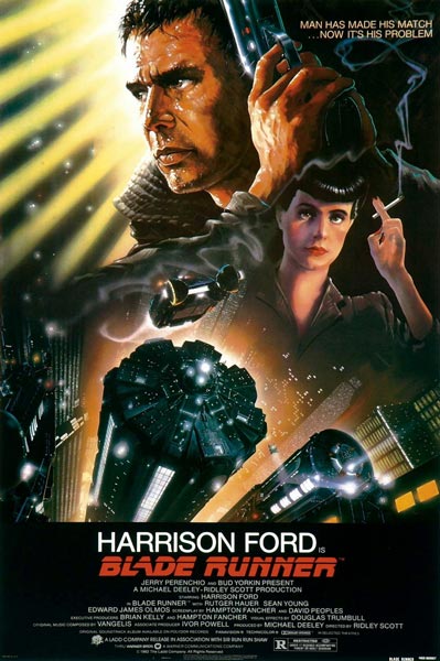
Blade Runner Poster Review (TuVie Day)

Directed by the brilliant Ridley Scott, Blade Runner is a fascinating film that was way ahead of its time and a good portrayal of the future city scenery that would be adopted by sci-fi films to follow in later years such as The Fifth Element and plenty of others.

The story follows the life of a Blade Runner named Deckard (Harrison Ford) – an agent that tracks down engineered humans, known as replicants in the movie, and terminates them in the year 2019. It’s a fairly standard cop hunts villains type of movie, however, they are also hunting for him, which adds another element of excitement to the plot.

Movie Poster Analysis

John Alvin, who also created the Gremlins and Star Wars Anniversary movie posters, created the movie poster for Blade Runner. The poster is an impressive piece of artwork, which identifies the replicants and the humans clearly and separately by adding sharper detail to the illustration of Deckard’s face in comparison to Rachael (the female character on the right) who is illustrated as a replicant through less sharpness and slightly thicker watercolours. She also looks similar to the Anime illustrations like Astro Boy.

The awesome scenery of the city tops is illustrated well to provide the reader with the futuristic element of the film and the punchy one liner “Man Has Made His Match…Now It’s His Problem” subtly opens you up to the theme of androids effectively.

Overall, the movie is perfectly illustrated in this poster and doesn’t leave too much to the imagination so as a first time viewer of it you’d get the gist of what it is all about.

22 October 2012

Moving Away From Apple Products A Little Bit


Apple is clearly one of the most popular brands for portable devices from tablets to smartphones in the UK. I'm not trying to spark a debate between Macs and Androids but it’s an observational analysis that most people have at least an iPhone or iPad on the London tubes.

After already owning an iPhone 4, I thought about getting the 5 but decided against it as my phone is still in great condition and I wouldn't be getting much more out of the new iPhone that I don't already get from my current model. This was the first instance where I've not followed the trend, as great looking as the iPhone 5 is.

Following this I decided I'd like to get a tablet because starting up the PC or Laptop at home is taking forever before I can quickly browse for something on the internet, and the tiny screen on my iPhone can be irritating unless if I'm out and on the go. The iPad was of course the first product I looked at because of the experience I've had with my iPhone.

I'm not sure why, maybe its the fact that I'm becoming wiser of the true value of things with age, but I couldn't justify parting with £330 of hard earned cash for the convenience I was after and the new iPad mini is rumoured to retail at around £300 - still far too much for my liking. So I decided to turn to the android side of life.

After looking at all the different tablets on the market I'd assessed that the Nexus 7 was the next best thing. The screen size is perfect - not too big and not too small. Also, I know that HTML5 etc are supposed to be making flash somewhat obsolete but I was relieved that I wouldn't get caught up as a casualty in one of Apple's corporate wars.

It has made me think though am I moving away from the Apple trend because I've always been a fan of their products since the launch of the iPod like many others who were attracted and bound by this innovation? As competitors begin to open up the mobile market for alternatives will I be brand hopping? I'm not sure.

On an Apple plus note, I'll be looking for a laptop later this year and I can definitely say that I can find no competitor for the MacBook pro yet. As an amateur designer, my experience with laptops and PCs so far using Adobe software hasn't been as smooth as I'd like. We'll see what they come up with in the following months but so far it looks like I'll be heading back into Apple's arms by the end of the year.

18 October 2012

Brilliant Ideas for Great Flyer Design

Flyers are a brilliant traditional print medium that has multiple uses, from wedding invitations to advertising. They can be printed on a range of different stocks to impress those receiving them including gloss, silk, and a variety of others, giving an attractive 2D design further depth.

There are some basic “rules” that should be learned before diving straight in and creating a flyer which are outlined in this article: “How to Design a Successful Promotional Flyer”. Once you’ve read that you can start getting creative and creating something completely original to suit the purpose of your flyer, be it for personal or business use.

In an attempt to inspire you before you begin putting pen to paper, we’ve sourced some really attractive and captivating flyer designs that you’re going to love. Read on and let us know what your favourites are.
Image Credit

Image Credit

Image Credit

Image Credit

Image Credit

Image Credit

Image Credit

Image Credit

Image Credit

Image Credit

Share This Page