26 October 2012
The Evernote Smart Notebook by Moleskine: An Honest Overview
Don’t get me wrong, Evernote is a brilliant note taking platform. I use it on a daily basis to sync notes via the cloud to all of my devices which saves emailing individual pictures and corresponding notes using separate programmes. But as you’ll notice from my tone, I’m not a great believer in the benefits that Moleskine’s Smart Notebook provide.
This new “innovative” notebook is available to buy in both small (A6-A7 size) and medium (A5-A6 size) from $24.95 on Moleskine’s website - the innovation being that you can use a smartphone loaded with Evernote’s application to take a photo of your handwritten notes and illustrations. Sounds like something I was doing 5 years back with my Nokia N95 and a £1 notepad from my local high street. But wait! There’s more.
The pages within the book aren’t your regular ruled lines. They are dotted ruled lines, which according to Evernote accurately skews your work once the app has read the dot pattern so that you eliminate the problematic slanted shot of a page. The other version of the notebook also contains pages with dotted lines but as a grid pattern - more suitable for graphic designers.
Another supposed benefit of this book & app combo is the removal of shadows from the photos you take of the notebook, however, as a photographer myself I’m not convinced by this. First of all Evernote advises that “using your flash ensures that you’ll get the highest quality image” (http://blog.evernote.com/2012/08/24/the-new-evernote-smart-notebook-by-moleskine/) in which case you won’t get a shadow - you can even try this now by taking a snap of a word on a piece of paper with your smartphone. Secondly, the automatic removal of shadow, if true, is an amazing innovation as in my experience this is quite a lengthy Photoshop process, which has lead to me just re-taking photos. Hmm?
Last but not least is my favourite selling point: stickers! Yes that’s right you get stickers which allow quick tagging of your pages. All you have to do is stick one on the appropriate pages and your notes are categorised into the corresponding notebooks that you’ve registered each of the stickers to. But what do you do when your stickers run out is my question? Costly methinks when you could do this manually via the app.
So what are my final thoughts on the Evernote Smart Notebook? Well the upside is that you get 3 months of Evernote’s premium service which gives you a whopping 1GB upload allowance per month as well as a few other service related features. The downside is I don’t understand who this notebook is targeted at. Serious graphic designers and illustrators will have their methods of digitising their creative work using tablets, scanners, and a range of software suites. So who?
Give us your thoughts on Evernote’s Smart Notebook. A new age designer’s essential or a flash in the pan waste of money?
23 October 2012
Blade Runner Poster Review (TuVie Day)
Directed by the brilliant Ridley Scott, Blade Runner is a fascinating film that was way ahead of its time and a good portrayal of the future city scenery that would be adopted by sci-fi films to follow in later years such as The Fifth Element and plenty of others.
The story follows the life of a Blade Runner named Deckard (Harrison Ford) – an agent that tracks down engineered humans, known as replicants in the movie, and terminates them in the year 2019. It’s a fairly standard cop hunts villains type of movie, however, they are also hunting for him, which adds another element of excitement to the plot.
Movie Poster Analysis
John Alvin, who also created the Gremlins and Star Wars Anniversary movie posters, created the movie poster for Blade Runner. The poster is an impressive piece of artwork, which identifies the replicants and the humans clearly and separately by adding sharper detail to the illustration of Deckard’s face in comparison to Rachael (the female character on the right) who is illustrated as a replicant through less sharpness and slightly thicker watercolours. She also looks similar to the Anime illustrations like Astro Boy.
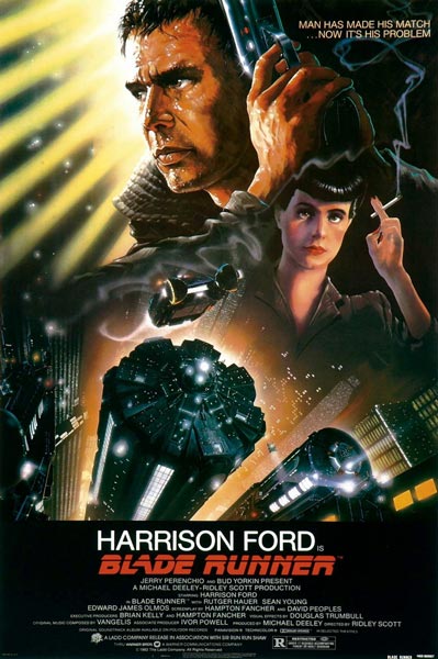
The awesome scenery of the city tops is illustrated well to provide the reader with the futuristic element of the film and the punchy one liner “Man Has Made His Match…Now It’s His Problem” subtly opens you up to the theme of androids effectively.
Overall, the movie is perfectly illustrated in this poster and doesn’t leave too much to the imagination so as a first time viewer of it you’d get the gist of what it is all about.
22 October 2012
Moving Away From Apple Products A Little Bit
After already owning an iPhone 4, I thought about getting the 5 but decided against it as my phone is still in great condition and I wouldn't be getting much more out of the new iPhone that I don't already get from my current model. This was the first instance where I've not followed the trend, as great looking as the iPhone 5 is.
Following this I decided I'd like to get a tablet because starting up the PC or Laptop at home is taking forever before I can quickly browse for something on the internet, and the tiny screen on my iPhone can be irritating unless if I'm out and on the go. The iPad was of course the first product I looked at because of the experience I've had with my iPhone.
I'm not sure why, maybe its the fact that I'm becoming wiser of the true value of things with age, but I couldn't justify parting with £330 of hard earned cash for the convenience I was after and the new iPad mini is rumoured to retail at around £300 - still far too much for my liking. So I decided to turn to the android side of life.
After looking at all the different tablets on the market I'd assessed that the Nexus 7 was the next best thing. The screen size is perfect - not too big and not too small. Also, I know that HTML5 etc are supposed to be making flash somewhat obsolete but I was relieved that I wouldn't get caught up as a casualty in one of Apple's corporate wars.
It has made me think though am I moving away from the Apple trend because I've always been a fan of their products since the launch of the iPod like many others who were attracted and bound by this innovation? As competitors begin to open up the mobile market for alternatives will I be brand hopping? I'm not sure.
On an Apple plus note, I'll be looking for a laptop later this year and I can definitely say that I can find no competitor for the MacBook pro yet. As an amateur designer, my experience with laptops and PCs so far using Adobe software hasn't been as smooth as I'd like. We'll see what they come up with in the following months but so far it looks like I'll be heading back into Apple's arms by the end of the year.
18 October 2012
Brilliant Ideas for Great Flyer Design
There are some basic “rules” that should be learned before diving straight in and creating a flyer which are outlined in this article: “How to Design a Successful Promotional Flyer”. Once you’ve read that you can start getting creative and creating something completely original to suit the purpose of your flyer, be it for personal or business use.
In an attempt to inspire you before you begin putting pen to paper, we’ve sourced some really attractive and captivating flyer designs that you’re going to love. Read on and let us know what your favourites are.
 |
| Image Credit |
 |
| Image Credit |
 |
| Image Credit |
 |
| Image Credit |
 |
| Image Credit |
 |
| Image Credit |
 |
| Image Credit |
 |
| Image Credit |
 |
| Image Credit |
 |
| Image Credit |
16 October 2012
The Fall Movie Poster (TuVie Day)
The locations and scenes within the movie are wonderfully directed, transporting you from a 1920s infirmary to a fantasy world and back through the stories of a stunt man to a little girl who has also been admitted for a broken arm.
I don’t want to give a great deal of the plot away other than that but if you watch the trailer you’ll get a great idea of what the film is about and witness a handful of the incredible scenes that combine to form this awesome movie.
Check out the trailer for The Fall below:
9 October 2012
TueVie Day - 500 Days of Summer
8 October 2012
Getting to Grips With Adobe Illustrator
To share some of the resources I've been using, as a total beginner on AI, I have selected my five favourite tutorials from last week which you can learn from if you are also a Noob or maybe refresh yourself if you've not used a range of tools it has for a while.
5 Adobe Illustrator Tutorials for Beginners
How to Create a Cute Bunny Vector Character

This tutorial shows you how you can take some really basic shapes and transform them into a cute little bunny. This lesson can provide you with a first step towards creating some original and unique characters of your own. To begin this tutorial visit: http://vector.tutsplus.com/tutorials/illustration/how-to-create-a-cute-bunny-vector-character/.
Create a Rolling Stones Style Mouth n Tongue
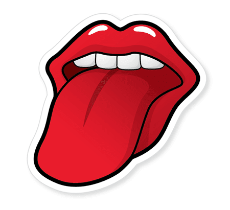
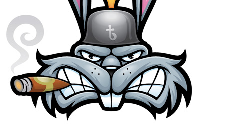
Thug Bunny Symetry Tutorial
Making a Cake Illustration
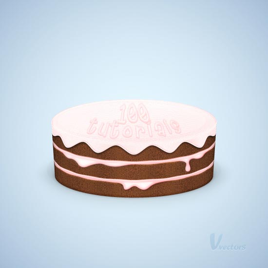
Nearly as good looking as the real thing, this tutorial teaches you how to make a tasty looking treat. Moving through a range of different tools this one takes you into a 3D element of illustration. Try this tutorial at: http://vector.tutsplus.com/tutorials/illustration/how-to-create-a-detailed-cake-illustration/.
Create a Vintage Badge

That's all for now. I hope you find some inspiration in these tutorials as well as learn how to transfer your paper makings into graphic designs. Good luck and have fun the same way I have. Just be patient.
5 October 2012
Autumn's Natural Beauty
What was once green is now becoming a mixture of reds, browns, yellows, and oranges. The streets begin to look as though they are on fire with the litter of leaves whirling around in the brisk air, almost like a delicate ballet of colour.
The change from summer to autumn is perfectly captured in this photograph which is today's IP favourite from Deviant Art user Kariliimatainen. Admire its beauty and get ready for the chill.


