Enrich your design: leaflet printing from Solopress

31 July 2012

Movie Day - Chariots of Fire

To continue the Olympic theme throughout my blog this week, I've decided to make this Tuesday's film poster of the week an iconic movie in Olympic circles (or rings). This week's film poster is Chariots of Fire.

Image Source: http://www.impawards.com/1981/chariots_of_fire_xlg.html


This beautiful photograph depicts the famous scene of the runners on the beach, a key scene used in the opening ceremony of the 2012 London Olympics where Mr Bean was added for good old British laughs! It's an inspirational photo for aspiring athletes and one which summarises the movie in a simple fashion. In case you've never heard of it, here's the trailer:

30 July 2012

Usain Bolt Dedication

I know that the intention of this blog is to share inspiration for print designers and artists, however, seeing as it's the London Olympics I couldn't turn down the opportunity to share this amazingly brilliant and artistic haircut dedicated to the Jamaican 100m sprinter Usain Bolt! I'm sure that Team Jamaica will love this one. Tell me what you think of it in the comments below.

Image Source: https://twitter.com/randalwhitmore/status/229919333739003904

Inspirational Olympic Themed Prints

Seeing as my country is the host to the greatest sporting event in the world, I decided it would be nice to share with you my favourite pieces of Olympic themed prints. So far it has been a success in terms of showmanship. Danny Boyle displayed a perfect portrayal of the heritage of Great Britain in his stunning opening ceremony that embodied history, humour, and passion. Performance wise Team GB hasn't had a great start but fingers crossed we'll put it out of the bag.

Scanning the internet I found some controversial pieces of art which I am not going to display today. Instead, the prints I have selected are supportive of the Olympics and its brand. I will save the more controversial works for later on this week ;)

So without further ado here are my favourite Olympic themed prints so far:

Andrew Maunders London 2012 Poster

Image Source: http://www.apartmenttherapy.com/accessories-for-your-london-olympics-party-174501

Brent Couchman Olympics Poster

Image Source: http://eighthourday.com/blog/best-today-1-2012/

Dieter Braun Olympic London Poster

Image Source: http://www.culturelabel.com/olympics-dieter-braun.html

26 July 2012

Amazing Flipbook Animations

Animation is one of the best ways that a simple drawing can be brough to life with patience, attention to detail and good vision from the artist. The fact that 24 frames are needed to produce one second of film puts the hard work invested into its creation into perspective. Aparently, we only ever see six unqiue frames per second, however, there could be animations where every frame in unique, in which case the artists must have the patience of a Saint and the determination to see their work take form.

Looking back at GCSE art in high school I remember a lesson I was taught in creating flipbook animations. This equated to nothing more advanced than drawings of stick men running about or walking at the time but was the concept upon which animation was constructed.

Following this trip down memory land I decided to source some of my favourite hand-drawn flipbook animations I'd seen on the internet. Enjoy!


Matrix Style Flipbook Animation


Sonic The Hedgehog


Winter Gloves - Let Me Drive Music Video


The Samurai Showdown

What's Your Favourite Flipbook Animation?

Let me know if you have a favourite flipbook animation in the comments section below. I love to find new talent like this and give praise to all of the artists who created these astonishing pieces of work.

24 July 2012

Movie Day - Attack of the Killer Tomatoes

This week I decided to make an effort to find one of the worst films created with something cool about the artistic work put into its film poster. Today's example is an absolute beauty and reeks of a horror movie on a tight budget making it a good cult film if you're going to get technical. This week it's Attack of the Tomatoes.

Image Source

There's a couple of features I really like about this film poster. I love the retro font that's been created as it reminds me of great films like The Running Man and Tron in addition to the Pac Man gaming generation. What I also love is the print quality as its like a classic comic book overlay. It's a poster that would attract me to watch the film only to discover it was a total stinker. For your pleasure though, here's the trailer:


17 July 2012

3 Pieces of Poster Worthy Art

First of all apologies for not blogging the last couple of days but I've been insanely busy. Anyway back to the inspiring print for all my lovely readers.

So...there's many times in life when you see a piece of art or design that captivates you to the point where you'd love to have a poster print of it (framed or not) in one of your rooms at home (normally the bedroom). I think its something psycological to do with a piece of your personality being displayed in your living environment. Whatever it is, I've got three great pieces to share that are definitely poster worthy. It's a shame I don't have the space for anything new at the moment.

Roy Lichtenstein'sWhaam!

This great artistic work from the 60s is comic themed and a piece that I've loved since I was a teenager, possibly due to its comic book reference from "All American Men of War".

Image Source

Pink Floyd Back Catalogue

Pink Floyd's awesome album art was beatifully painted onto the backs of the models by Phyllis Cohen and photographed by the very talented Storm Thorgerson. I already have this as a poster in my bedroom!

Image Source

Banksy Tesco

I love Banksy's effort to poke fun at Tesco's dominance in the UK in this piece of graffiti art. Definitely a poster I want in the office.

Image Source

Let me know what you're favourite pieces of artistic work are that you'd have framed and walled in your house in the comments below.

12 July 2012

3 Examples of Cool Pixel Art

As much as I hate to admit that I'm a closeted geek, my taste in art, music, film and even games can paint a fairly good checkered shirted, bow tied, Converse wearing picture (not to be too steroetypical mind). Therefore, my love for pixel art is expected as a fan of early Space Invaders games and Tron. That's why I've decided to share some pieces and artists of pixel art that leave you interpretting as well inspired to create your own simple pieces, pixel by pixel.

Michael Myers

Michael Myers is a very talented artist whose pixel art versions of iconic film characters, such as the cast of Star Wars, has been very well received by fans of the film. My favourite is of Jabba the Hutt but more of Myers' characters amongst his other work can be found on his website: Michael Myers Star Wars Pixel Art.


Pac Man Ghosts

Some clever artist has created Pac Man Ghost versions of iconic film and game characters. A simple pixel artwork that has repurposed the already awesome ghost shapes to form something geekier and more fun.


A Taco?

Here's a perfect example of the a common type of pixel art that would be printed on a canvas and hung up in someone's home. It's suggestive that the image formed is a taco but there is always an element of interpretation needed. Other examples of this style include pixelated bodies which are wearing swim suits that can be interpreted in different ways due to the large pixels and colour choices.


Let's Finish With a Pixel Video

I thought I'd finish with a little YouTube video I found which shows what our world could be like in pixels if the pixel games merged with reality. It is evidently titled Pixels by director Patrick Jean.

If you have any favourite pieces of pixel art please share them in the comments section and I'll share them via Twitter if I'm a fan. Enjoy...


11 July 2012

A Couple of Typography Tips

Recently I've been thinking of different ways that companys or organisations can get their messages across creatively in print media. This lead me to think of typography as an artistic way to do just that. It's been used by many companies previously and is commonly used to illustrate famous people based on their historic quotes, such as this one of Ray Charles:

Image source: http://www.flickr.com/photos/andydoering/4464071577/

Simple Words

If you're deciding to create a cool typography piece to promote an event or just get creative then its worth thinking about what words you're going to use. Say you've got a live music event you're trying to promote, the most obvious choice of words will be the names of the artists and bands performing e.g. Glastonbury could create a tree silhouette from the names of bands.

Some companies might have a big catalogue of products therefore the simplest words to use would be categories or even customer perceptions and values of the brand. A cool example is one of the typography pieces that create a map of the world.

Image source: http://bpblogging.files.wordpress.com/2012/04/11158-world-map-names-country-countries-typography_-colorful.png

Space

Unless if you're trying to create a sketchbook style piece like the Ray Charles example, space should be used to keep the readability of the words. It's the amazing thing about typography art. Two different artistic forms of writing and design come together to create beautiful work. Therefore, let the words you've chosen come through to exploit that secondary artistic style.

For promotional purposes, it won't be good having a cool design that loses the message so space is just as important.

Recommendations

That's all I can advise without going into the technicalilites of the design creation but it's simple yet easy to forget when creating a great jaw-dropping typographic.

If you've got any cool Typography pieces you'd like to share simply post your links to them in the comments section below. I'll pin up the ones I like the most on my Pinterest page when I eventually get that going.

Also, follow me on Twitter if you feel like getting my micro-blogging updates @inspiringprint

Image source: http://dougklembara.com/journal/wp-content/uploads/2010/01/twitter-bird-typography.jpg
 

10 July 2012

Movie Day - Pulp Fiction

This week's inspirational movie poster is from one of Quentin Tarantino's hit films Pulp Fiction. This creative piece of work depicts an image of Uma Thurman that sums up the theme of the movie with objects relevant to the plot placed on the bed in front of her.

The title Pulp "Fiction" is played with in the design to make it look like the cover of a well read and travelled paper back novel. Even the corner is "dog eared".

Image Source: Google Images


The reason for this film poster's inclusion is the Cult packaging it applies to a non-cult film. I love the font used and the imagery is one that always rings to memory when thinking of Quentin Tarantino, a similar memory commitment that many of his fans also potentially share.

One of the artistic companies behind this historic film poster is Tarhan Creative who also created poster artwork for Kill Bill, Chicago, and the Scream movie franchines. The other is Indika Entertainment Advertising who are responsible for the film posters of Oceans Eleven and Snatch.

9 July 2012

Inspiring Art For My Feature Wall

Soon I will be moving into a new place and thought I'd enjoy a fresh start, therefore, I scanned Pinterest for some great pieces that I could use to create my feature wall. Here are a few inspiring designs that I came across which I'll create similar versions of but either get printed onto wallpaper first or just go for it and paint straight onto the wall. Not sure which yet.


Source: wookmark.com via Katie on Pinterest


Source: etsy.com via Abigail on Pinterest


Source: xkcd.com via Enrico on Pinterest


I'm hoping to take a little something from each of these to create my masterpiece and this is just a selection of my favourites. I might end up coming up with something else completely different. The joy of it all!

5 July 2012

String Augmented Reality Brings Print to Life

This morning I came across one of the newest and coolest ways to bring print designs to life thanks to a good friend of mine we'll call Mr T. This morning I was introduced to String.


String is a new IOS application which is usable via the iPhone or iPad which creates augmented reality from a series of gorgeous printed designs by the String team themselves. It's hard to explain so it's best I just show you through a YouTube video I've found.


I recommend you try it for yourself because this blew me away in my search for ways to bring print to life. Notice how you can change the angle you're viewing it from to get a different perspective of the augmented image. Information on the app and the prints you can download to create the augmented reality are available at String's website: http://www.poweredbystring.com/.

Think of the possibilities this could present if utlised with 3D Glasses. I hear Google is cracking on with this one but for now this is keeping me entertained. I think if this was placed in a magazine, billboard, train station, wherever, I think it would be an awesome sight for passers-by and a great opportunity for business to advertise themselves.

H696C7H48EKH

4 July 2012

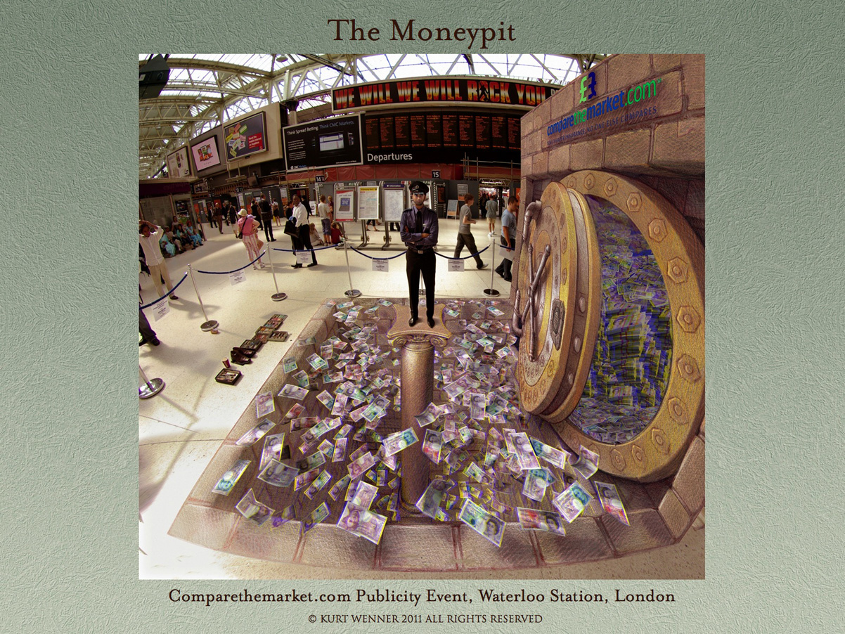
Amazing 3D Street Art

I love to see the different imaginitive ways that artists make bring their illustrations to life and so far this one takes the biscuit. A selection of different street artists have moved on from the stereotypical Mary Poppins chimney sweep style to a new and exciting talent, creating 3D illusions and bringing life to their once lifeless designs.

After browsing the internet I've decided to showcase some of my favourites:

Lava Burst

Image Source: Edgar Muller

The Moneypit

Image Source: Kurt Wenner

HDI

Image Source: Google Images

To summarise, I love these pieces of street art. The last two interestingly advertise two brands the middle one is for Compare The Market and the bottom one is for an insurance company named HDI. It's true that these street art pieces are captivating to passers-by but what about the incorporation of this style into magazines and flyers? These inspirational artists leave me wondering whether or not the same effect can be created through traditional print media.

3 July 2012

Tuesday is Movie Day

That's right, today is the second installment of Movie Tuesday. This is a chance for me to find my favourite film poster from the collection of movies I've admired the artwork for. The majority of these posters are the hand painted variety rather than digitally created ones, which I prefer to some degree because of the vintage feel it gives to the movie.

This week gives praise to one of the coolest films from the 50s which probably became the kindling for men with fantasies of giant women. That's right this week's favourite is from the movie "Attack of the 50 Foot Woman".
This film poster is a good example of explaining the plot through art in the simplest way possible. Of course it wasn't too hard back in the 50s as the plots weren't as ellaborate as they are now. 

The poster has a James Bond-esque feel to it which is part of the reason as to why I find it one of the most inspirational print pieces out there. Everyone is so caught up in digital arts these days that it would be refreshing to see some creativity take some talent from the past and repurpose it. Imagine a business card with this kind of artwork applied. Impressive right?

This film poster was created by the great Reynold Brown. As you can see from the link, plenty of his works revolved around the 50's fashionable sci-fi movies. Check him out.

2 July 2012

Linkin Park Art - Shinoda Art

During my teen years I was a great fan of Linkin Park and I guess I still am...although I haven't heard the latest album. After admiring their artistic musical skills I turned my attention to the rapper and keyboard player of the band Mike Shinoda when he launched his side project Fort Minor. Then I later discovered he had created the album artwork for The Rising Tied (the side project album of Fort Minor). I was captivated by the grafitti style and multitude of colours it presented.

Image Source: Flickr
After discovering Shinoda's talents on paper I then sought after his other work to which I discovered his portfolio website http://mikeshinoda.com/ which now contains a running blog and praise to other artistic community projects. Overall I find his graffiti style somewhat unique and reminiscent of what everyone was drawing in their sketchbooks at school as the characters he creates leave an impression, such as the latest Alice In Wonderland themed piece which has taken the 3D form:

Image Source: Shinoda Art

Finding a single home for all of his artwork is becoming a challenge so I'll leave it to you to Google it if you're still fascinated. Some of it can be found here: Shinoda Art.

Share This Page