Enrich your design: leaflet printing from Solopress

21 August 2012

Movie Day - Dirty Harry

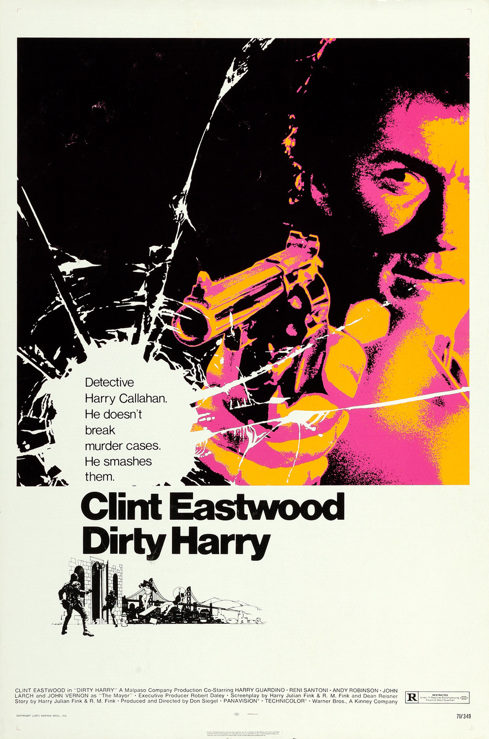
Dirty Harry is another of the classic films that everyone knows because of it’s iconic scene where Clint Eastwood is looking down at the baddie and utters the memorable words “do you feel lucky punk?” This scene is very much like the image portrayed in the film poster.

What I love most about the poster is the cracked glass layover effect, which makes it look like Eastwood has shot through a panel of glass. The illustration below the coloured image has a silhouette effect similar to those found in the Reservoir Dogs art, giving a strong visual impact in addition to a snippet from the movie itself.

Overall, the movie’s great and the poster grabs your attention leaving little to the imagination as to what to expect from the film itself. If you were a fan of his previous films you would imagine it being a western film in the city. Below the poster is the classic scene I was talking about earlier.

Image Source


20 August 2012

Back from Jelly Fest

So I'm back after a much needed weekend of sun, music, and cider. Jelly festival was a big hit and I'd recommend anyone looking for a small alternative festival next year to check it out. It was a great ear opener to the many talented folk, reggae, and down right non-commercial musicians that you won't hear on the radio anytime soon but perform to impress.

The whole weekend gave me some great exposure to the country roads of Britain, which are an absolute dream to drive, and made me think of some great nature inspired photography. I've decided to find some absolute favourites that sum up my weekend to share with you so you can be inspired to jump down to your nearest camping site or festival before the sun turns its back on the UK.

Image Source

Image Source

Image Source

Image Source

16 August 2012

Festival Posters of 2012

This weekend I will be fortunate enough to visit the Jelly Festival in Norfolk. I'm excited because there are some pretty good DJs like Alex Metric and Jakwob on the line-up so I'll be spoilt for choice when it comes to selecting who I want to watch perform and when.

I was impressed by the quality of their poster design promoting the festival, which featured the classic circus/ fairground-style font and a host of images that reminded me of the Monty Python era. It's combination of black and white sketch with other contrastic graphic styles also grabbed my attention along with the colour choices. It was a truly unique and captivating illustration.

Following this beautiful visual experience, I started to wonder how many truly unique and creative festival posters had been created this year to promote themselves in the most interesting ways possible. So for your delight, below is a list of 2012's most creative music festival posters.

Image Source


Image Source


Image Source


Image Source

Image Source

Image Source

Image Source

Image Source

Image Source
Image Source


Image Source

Share This Page