I'm a big supporter of working for others to learn from, as well as primarily working for passion and financial gain of course. This is why I amongst many others am a big fan of the works of great magazines and websites such as Creative Bloq and Smashing Magazine. They not only provide updates on trends and innovations within the design community but they also teach the future designers of today with tutorials and free resources. The tutorials are not simply for the purpose of teaching though.
Many of the tutorials and lessons provided are a result of some really awesome design created by an inspiring artist who then picks apart their creation to provide the methods behind their madness. It might not have been the intention of that artist to inspire people with his creation. It might have been to serve a purpose e.g. creation of a new logo for a client in exchange for money. The inspiration is perceptive from the viewers of the artists' work who seek to create similar creations.
Last night I came across this fantastic piece of artwork on Adobe's blog which not only provides visual stimulus to inspire my own creations but it also gives a very in-depth tutorial for others to learn from.
It is great work such as this which makes me think should designers keep it in mind that their art could one day inspire someone to create something equal if not great to it? If that is the case should every illustration be created with equal passion to present our best work every time no matter the size of the task?
I think it is great questions such as these which should be commited to memory with every brush-stroke or mouse-click designers and artists make. It is a great feeling to know that your own creation could inspire the future Picasso. After all the notion that every original idea is simply a remix of previous ideas is one that appears evident in many current day 'invention'. The TED Talks video below by Kirby Ferguson champions this very notion. What are your thoughts on the matter?
Two weeks ago I watched the outstanding Dark Knight Rises
film, Christopher Nolan's final instalment of the awesome Batman trilogy. I
understand that it has a completely different and darker take on The Caped
Crusader compared to its previous versions; however, in my opinion this has
been the greatest of all the Batman films created…ever!
The artistic creation of the film poster for this great
movie managed to keep the majority of the plot on the Q.T. until its premiere.
Now that I’ve seen the film it makes much more sense to me and for now I don’t
want to give too much away as I know there’s still people out there who haven’t
seen it. All I’ll say is that the “Rise” is quite literal and the poster
reflects that particular scene.
So for your enjoyment here is one of the official Dark
Knight Rises film posters, followed by the movie trailer:
Over the weekend I spent some time on art and design forums to look for some general chat on the topic and I came across an artist who used light with hanging tetrahedron frames to create shadows, supposedly related to the city as they'd chosen to play a CD of city background noises with the display. The image created did look pretty cool, like a bunch of post falling in my opinion, but more than anything it got me thinking about the creation of shadows and how artistic they can be. The artist's work can be found at this art forum thread: http://www.artforums.co.uk/forums/viewtopic.php?f=51&t=1379.
The forum got me reminiscing of my final year of sixth form when I created the set design for a small theatrical production - the final year project for my drama course. We used shadows as a way to add drama to a scene, which lead to me creating a series of free-standing door frames with tracing paper trapped in the middle of them so that when light was shone from behind a frame the shadow of the person behind it would be cast, visible on the front facing side of the frame as just a shadow of a man/ woman. It worked really well and scared the audience when the real person punched through the tracing paper frame - perfect for our off the wall version of Berkoff's "The Trial".
Combining my experience with the forum artist's project I started to think of how dramatic this art form could be. Imagine a large frame filled with tracing paper in an art gallery with light shone from behind it, casting the shadow of a series of objects to visitors presented with the front facing side as they enter. Combined with the right soundtrack, a whole series of moveable or static creations could be made - similar to the shadow puppet stories or "shadow play" (http://en.wikipedia.org/wiki/Shadow_play).
I like this idea but I'm fully aware that it's been done on some level before. I've even seen it in a John Lewis advert once where they used light to present the shadow of a woman from their product range. It's still something I'd be interested in creating though.
Personally, I prefer more controversial art so if anyone has the capability to champion the idea I'm about to propose then I encourage you to do so as my current position won't allow me to. I'd like to see an artist take the tracing paper canvas shadow casting idea but also take the idea from the John Lewis advert where they used their products. Instead of using random products though I'd love to see something provocative e.g. thousands of branded chocolate bars, coke cans, and other obesity creating manufactured goods, which will form the shadow of a naked obese person. Next to it should be rolled up fashion magazines to create the shadow of an anorexic figure as a contrast, like Supersize vs Superskinny.
The audience should be allowed to look around the back of the frame to see what has formed the image they first see as just the shadows of two unhealthy figures. It's a weak and obvious example, however, I'm sure many other connections can be made such as the shadow of the breast cancer trust's logo with cigarettes being behind the 'canvas' casting the shadow.
I'm unaware as to whether these kinds of art have already been done but if they haven't then someone who likes to bring controversial issues to the surface should create it.
Let me know if you like the idea of if you know of someone who has already done it because I'm fascinated by this art form.
Pinterest has been a great way to create mood boards, bookmark influential designs, and create inspirational design sources for other creative minded individuals. It's easy to get lost in the plethora of beautiful stuff that it offers which is why we've chosen 5 of our favourite Pinterest boards which act as a good resource for those needing inspiration for their design projects.
Want yours included in our next inspirational Pinterest board blog article? Leave a link to it in the comments below.
/paulsvo/illustration/
This fantastic selection of illustrations by Paulsvo gives all sorts of creative ammunition to artists and designers whose weapon of choice is nothing more than a pen and some paper...maybe even a graphics tablet too.
Inside of Butteredmuffin's board there is an eclectic combination of artistic styles ranging from graffiti, street art through to sculptures, etc. The main image that grabbed my attention is the one shown below.
This board is full of really cool and artistic posters of all kinds, mainly of events. Retorta's board is definitely one for designers looking to create cool posters.
Colour is something we all as human beings take for granted
as we are born with this fascinating privilege of colourful sight, unless if
you’re born blind of course. For the majority of us, colour is a major catalyst
of universal design that evokes a wide variety of emotions – although it is
perceptual to each individual’s experiences in life i.e. red can be associated
to passion and love for one person and mean something completely different to
another individual, most likely in another part of the world.
By understanding the environment in which we intend to
unleash our designs, we can spark the desired emotional response to create an
affinity from consumer to creation – something that many businesses seek to
create in order to maximise the sale of their products or services.
For designers in the Western world who intend to release
their illustrations on their local demographic, the desire is there to always
follow the curve, as businesses do, and create a red heart for example as you
know that it is socially acceptable and the affinity to love is expected. But
is there something more to be had from confusing the senses of your expecting
audience? This is where the study of psychological response to colour can make
your design become “off the wall”.
Using the example of the heart, I’ve presented a few images
I’ve pulled from Flickr below which show a standard illustrative heart in
different colours.
Let me know what your emotional response is to each of
them in the comments below telling me which country you’re from so we can see
if there’s any difference between nationalities.
1. Green Heart
2. Red Heart
3. Wood Heart
It will be interesting to see what the results of this psychological test present. I will present an in-depth discussion on the topic following its results in a month's time. Please comment your responses to the designs presented above below.
Prior to this blog I was a photographer for a small nightclub in the London area and it taught me a lot about how to use my Canon 1000D SLR in low lighting to get some really cool shots (with the aid of a flashgun of course).
As well as trial and error I searched the web for advice and tutorials on how to use my SLR camera effectively to create impressive photos that patrons of the club would want to use and share. This lead to the discovery of multiple blogs, infographics and video tutorials which I'd like to share with you awesome readers in this blog post. Just keep in mind that when I started my photography job I was a noob so some of this information might not be of interested to advanced SLR users, however, it's always good to go back to the basics every now and then.
The Photography Cheat Sheet
This is a recent infographic that I stumbled upon by Miguel Gantioqui which explains the basic settings of SLRs and the effect it will have on the image you shoot. This is a great resource for SLR owners who are deciding to use the manual settings of the camera for the first time. More experienced users will understand that it is a balance of the different functions within this infographic that contribute to the quality/ style of image you want to produce. Therefore, for the noobs out there, don't stick to just modifying one setting. Play around.
Like anyone else looking on how to do stuff, I YouTubed it. So rather than having you waste your time looking for the decent quality channels on photography I'm going to give you a quick list of the ones I'd recommend:
Short list right? If anyone has any other channels they'd recommend or individual videos they rate highly for noob SLR photographers then please add then to the comments section of this post. After all it's all about learning right?
Photography Forums
There's a lot of value to be gained from becomming a member of online communities as you can get honest feedback and advice from a broad spectrum of users, from noob to expert. There are a couple that I checked out which were pretty good reads so if you feel like it sign up to them and get asking. If not just have a read of the stuff they're talking about, you'll learn quite a bit this way.
If anyone has a range of forums they checked out when they were starting out/ that they are still a member of, please feel free to add your suggestions in the comments section below.
That's all for now...
I hope you've found some use in the resoureces that I've provided above. I hope new users of SLRs can learn a whole lot from this and then go on to adapt these teachings to find their own methods. Don't forget the value in post-production as photo editing software such as Photoshop can add a whole other dimension to your images. I'll discuss this in another blog article some other day. Happy learning!
To continue the Olympic theme throughout my blog this week, I've decided to make this Tuesday's film poster of the week an iconic movie in Olympic circles (or rings). This week's film poster is Chariots of Fire.
This beautiful photograph depicts the famous scene of the runners on the beach, a key scene used in the opening ceremony of the 2012 London Olympics where Mr Bean was added for good old British laughs! It's an inspirational photo for aspiring athletes and one which summarises the movie in a simple fashion. In case you've never heard of it, here's the trailer:
I know that the intention of this blog is to share inspiration for print designers and artists, however, seeing as it's the London Olympics I couldn't turn down the opportunity to share this amazingly brilliant and artistic haircut dedicated to the Jamaican 100m sprinter Usain Bolt! I'm sure that Team Jamaica will love this one. Tell me what you think of it in the comments below.
Seeing as my country is the host to the greatest sporting event in the world, I decided it would be nice to share with you my favourite pieces of Olympic themed prints. So far it has been a success in terms of showmanship. Danny Boyle displayed a perfect portrayal of the heritage of Great Britain in his stunning opening ceremony that embodied history, humour, and passion. Performance wise Team GB hasn't had a great start but fingers crossed we'll put it out of the bag.
Scanning the internet I found some controversial pieces of art which I am not going to display today. Instead, the prints I have selected are supportive of the Olympics and its brand. I will save the more controversial works for later on this week ;)
So without further ado here are my favourite Olympic themed prints so far:
Animation is one of the best ways that a simple drawing can be brough to life with patience, attention to detail and good vision from the artist. The fact that 24 frames are needed to produce one second of film puts the hard work invested into its creation into perspective. Aparently, we only ever see six unqiue frames per second, however, there could be animations where every frame in unique, in which case the artists must have the patience of a Saint and the determination to see their work take form.
Looking back at GCSE art in high school I remember a lesson I was taught in creating flipbook animations. This equated to nothing more advanced than drawings of stick men running about or walking at the time but was the concept upon which animation was constructed.
Following this trip down memory land I decided to source some of my favourite hand-drawn flipbook animations I'd seen on the internet. Enjoy!
Matrix Style Flipbook Animation
Sonic The Hedgehog
Winter Gloves - Let Me Drive Music Video
The Samurai Showdown
What's Your Favourite Flipbook Animation?
Let me know if you have a favourite flipbook animation in the comments section below. I love to find new talent like this and give praise to all of the artists who created these astonishing pieces of work.
This week I decided to make an effort to find one of the worst films created with something cool about the artistic work put into its film poster. Today's example is an absolute beauty and reeks of a horror movie on a tight budget making it a good cult film if you're going to get technical. This week it's Attack of the Tomatoes.
There's a couple of features I really like about this film poster. I love the retro font that's been created as it reminds me of great films like The Running Man and Tron in addition to the Pac Man gaming generation. What I also love is the print quality as its like a classic comic book overlay. It's a poster that would attract me to watch the film only to discover it was a total stinker. For your pleasure though, here's the trailer:
First of all apologies for not blogging the last couple of days but I've been insanely busy. Anyway back to the inspiring print for all my lovely readers.
So...there's many times in life when you see a piece of art or design that captivates you to the point where you'd love to have a poster print of it (framed or not) in one of your rooms at home (normally the bedroom). I think its something psycological to do with a piece of your personality being displayed in your living environment. Whatever it is, I've got three great pieces to share that are definitely poster worthy. It's a shame I don't have the space for anything new at the moment.
Roy Lichtenstein'sWhaam!
This great artistic work from the 60s is comic themed and a piece that I've loved since I was a teenager, possibly due to its comic book reference from "All American Men of War".
Pink Floyd's awesome album art was beatifully painted onto the backs of the models by Phyllis Cohen and photographed by the very talented Storm Thorgerson. I already have this as a poster in my bedroom!
As much as I hate to admit that I'm a closeted geek, my taste in art, music, film and even games can paint a fairly good checkered shirted, bow tied, Converse wearing picture (not to be too steroetypical mind). Therefore, my love for pixel art is expected as a fan of early Space Invaders games and Tron. That's why I've decided to share some pieces and artists of pixel art that leave you interpretting as well inspired to create your own simple pieces, pixel by pixel.
Michael Myers
Michael Myers is a very talented artist whose pixel art versions of iconic film characters, such as the cast of Star Wars, has been very well received by fans of the film. My favourite is of Jabba the Hutt but more of Myers' characters amongst his other work can be found on his website: Michael Myers Star Wars Pixel Art.
Pac Man Ghosts
Some clever artist has created Pac Man Ghost versions of iconic film and game characters. A simple pixel artwork that has repurposed the already awesome ghost shapes to form something geekier and more fun.
A Taco?
Here's a perfect example of the a common type of pixel art that would be printed on a canvas and hung up in someone's home. It's suggestive that the image formed is a taco but there is always an element of interpretation needed. Other examples of this style include pixelated bodies which are wearing swim suits that can be interpreted in different ways due to the large pixels and colour choices.
Let's Finish With a Pixel Video
I thought I'd finish with a little YouTube video I found which shows what our world could be like in pixels if the pixel games merged with reality. It is evidently titled Pixels by director Patrick Jean.
If you have any favourite pieces of pixel art please share them in the comments section and I'll share them via Twitter if I'm a fan. Enjoy...
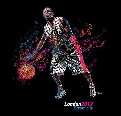
Recently I've been thinking of different ways that companys or organisations can get their messages across creatively in print media. This lead me to think of typography as an artistic way to do just that. It's been used by many companies previously and is commonly used to illustrate famous people based on their historic quotes, such as this one of Ray Charles:
If you're deciding to create a cool typography piece to promote an event or just get creative then its worth thinking about what words you're going to use. Say you've got a live music event you're trying to promote, the most obvious choice of words will be the names of the artists and bands performing e.g. Glastonbury could create a tree silhouette from the names of bands.
Some companies might have a big catalogue of products therefore the simplest words to use would be categories or even customer perceptions and values of the brand. A cool example is one of the typography pieces that create a map of the world.
Unless if you're trying to create a sketchbook style piece like the Ray Charles example, space should be used to keep the readability of the words. It's the amazing thing about typography art. Two different artistic forms of writing and design come together to create beautiful work. Therefore, let the words you've chosen come through to exploit that secondary artistic style.
For promotional purposes, it won't be good having a cool design that loses the message so space is just as important.
Recommendations
That's all I can advise without going into the technicalilites of the design creation but it's simple yet easy to forget when creating a great jaw-dropping typographic.
If you've got any cool Typography pieces you'd like to share simply post your links to them in the comments section below. I'll pin up the ones I like the most on my Pinterest page when I eventually get that going.
Also, follow me on Twitter if you feel like getting my micro-blogging updates @inspiringprint
This week's inspirational movie poster is from one of Quentin Tarantino's hit films Pulp Fiction. This creative piece of work depicts an image of Uma Thurman that sums up the theme of the movie with objects relevant to the plot placed on the bed in front of her.
The title Pulp "Fiction" is played with in the design to make it look like the cover of a well read and travelled paper back novel. Even the corner is "dog eared".
The reason for this film poster's inclusion is the Cult packaging it applies to a non-cult film. I love the font used and the imagery is one that always rings to memory when thinking of Quentin Tarantino, a similar memory commitment that many of his fans also potentially share.
One of the artistic companies behind this historic film poster is Tarhan Creative who also created poster artwork for Kill Bill, Chicago, and the Scream movie franchines. The other is Indika Entertainment Advertising who are responsible for the film posters of Oceans Eleven and Snatch.
Soon I will be moving into a new place and thought I'd enjoy a fresh start, therefore, I scanned Pinterest for some great pieces that I could use to create my feature wall. Here are a few inspiring designs that I came across which I'll create similar versions of but either get printed onto wallpaper first or just go for it and paint straight onto the wall. Not sure which yet.
I'm hoping to take a little something from each of these to create my masterpiece and this is just a selection of my favourites. I might end up coming up with something else completely different. The joy of it all!


